Brand Strategy Brand Identity CMF Strategy Product/Industrial Design Visualization Art Direction
Project
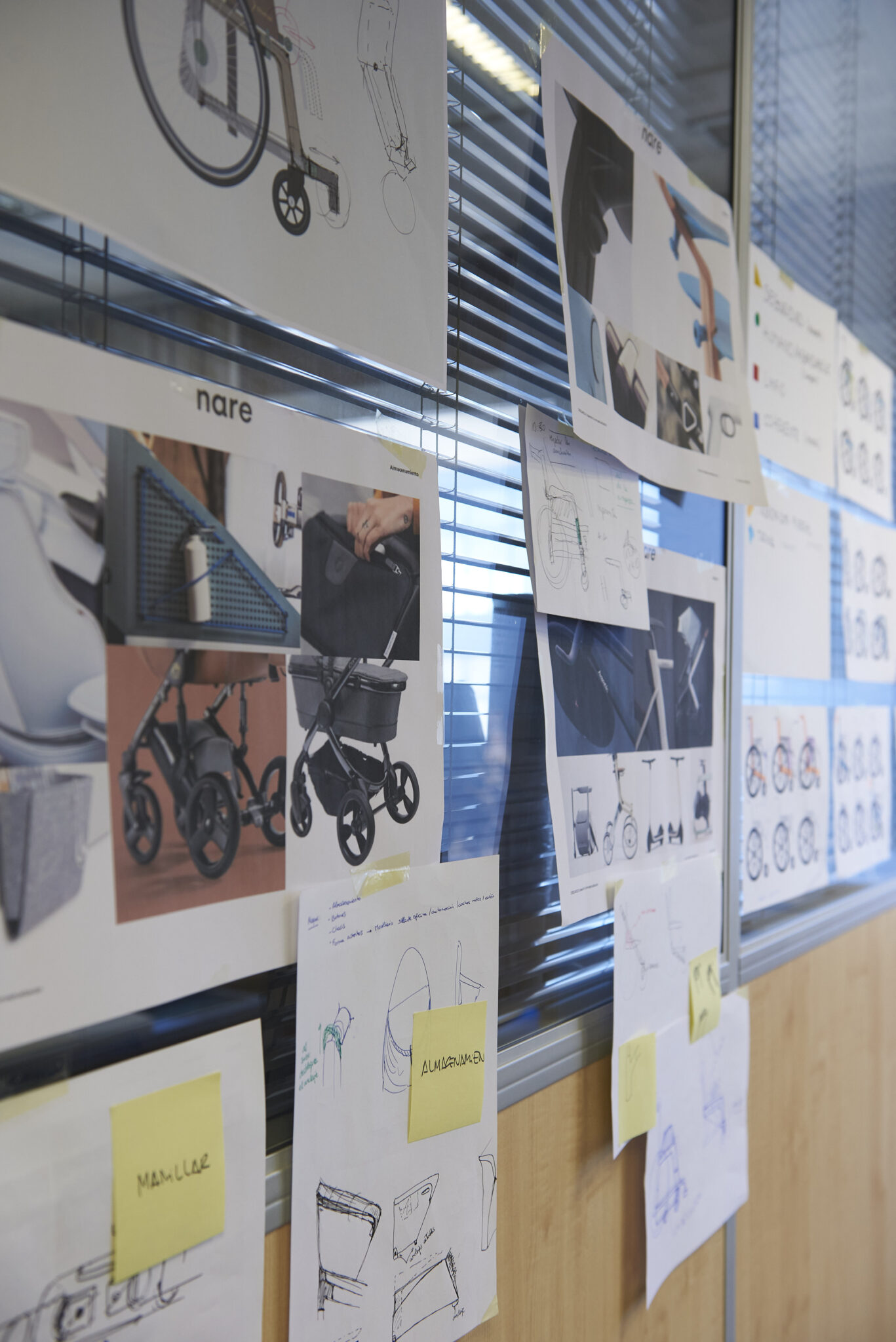
Human mobility
Year
2023
Sector: Orthopaedics products.
Context: Following the Bira Tween strategic innovation project that we carried out at Nare for the Agui group, we came to the conclusion that, for the launch of their new wheelchair, it was necessary to create a new brand with a new positioning and free of prejudices and opinions.
Challenge: The challenge, in this case, has been to elaborate a strategic framework as a guide for all the design actions of the new brand identity. Along with this, we have defined the different lines of work with the objective of accompanying and helping Bira to acquire a commitment to its new purpose. On the other hand, it was necessary to work in a holistic way a new brand strategy with a solid identity to guarantee its success in the market and, consequently, the continuity of the brand.
Process
Narrative
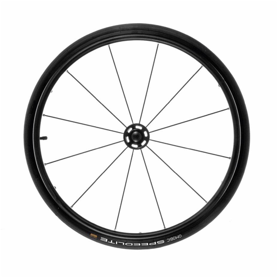
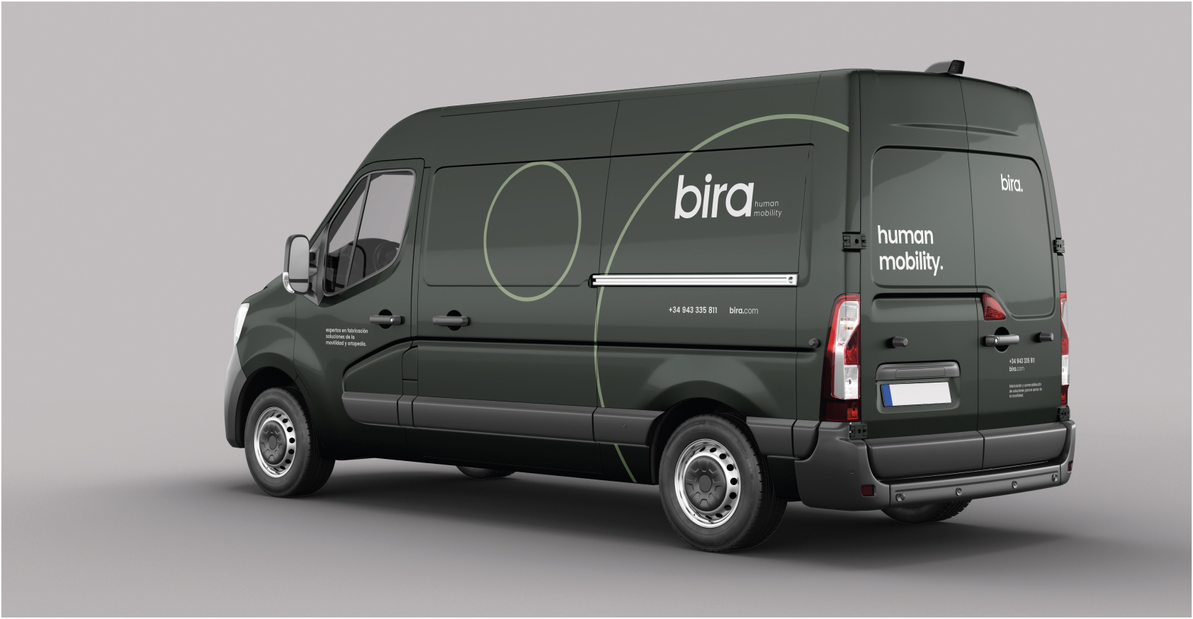
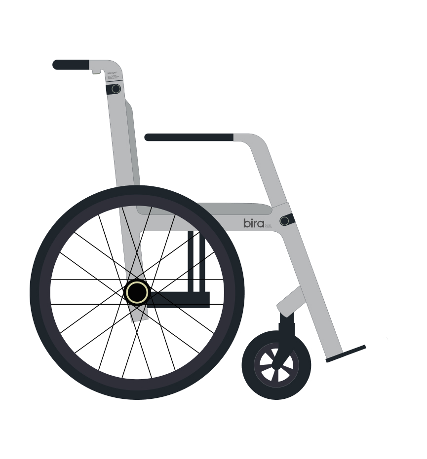
The wheel: main element of movement.
The proposal has taken the wheel as a starting point, since it is the primary element in the conception of a wheelchair and the basis of its operation. Likewise, the wheel allows us to represent not only the movement of a wheelchair, but also Bira’s eagerness to achieve a constant evolution in the sector.
In defining the wordmark, the concepts of movement and the product itself have been kept to a minimum and aligned with the wheelchair design approach.
Bira seeks to break convictions, exploring new ideas and innovating to contribute to a more inclusive world with high quality, responsibly manufactured products.
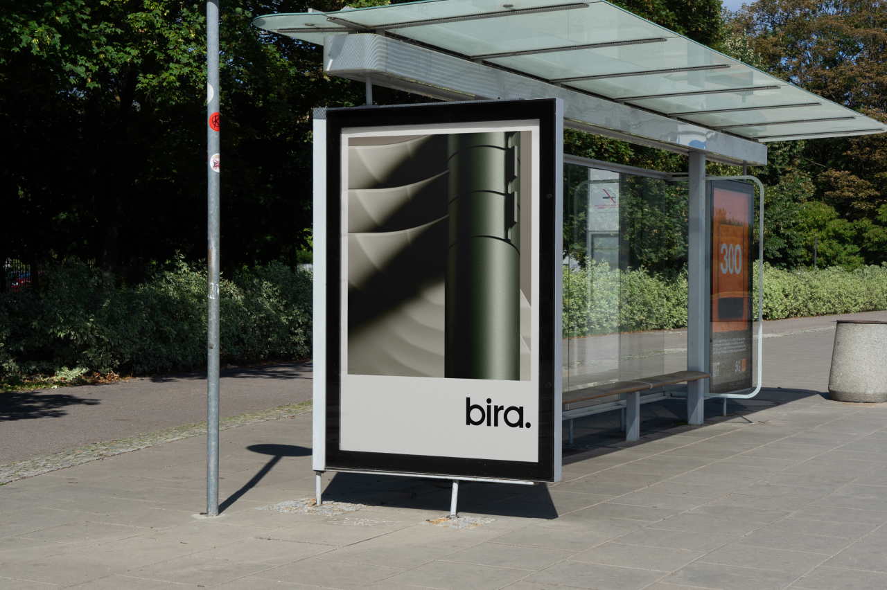
Wordmark
A logo that evokes simplicity, neatness and serenity.
A new voice for Bira.
The new wordmark has been custom-designed based on the compact and pure geometric Poppins typeface, adjusting the proportions and strokes of the letters to circles and rectangles to personalize it and connect it with the essence of the brand. The homogeneous thickness of the letters projects an image of consistency, thus aligning Bira’s purpose with its visual identity.
Custom-designed wordmark lettering has a global impact on the brand.
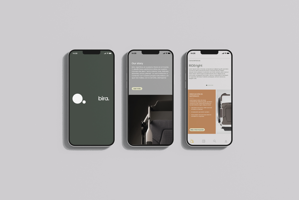
Imago
A simple and effective symbol.
The design of the symbol is intended to underline the elegant, timeless and simple nature of the product.
Since the basis of this sector is mobility, the introduction of motion in the graphics helps the brand to be associated in the collective imagination with it. Motion graphics has contributed to create a sense of sophistication in the visual appearance of the brand, as well as connecting the wordmark with the imagery.
The motion graphics design aims to tell Bira’s story to the public in a matter of seconds. This has helped to reinforce the brand’s memorability as well as bring innovation and avant-gardism.
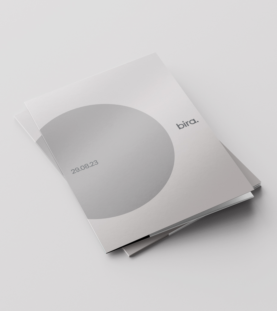
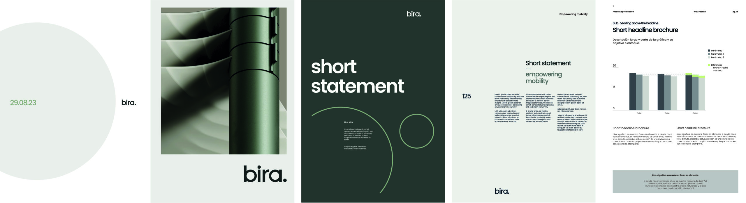
Graphic
Dynamism brought to static support.
We have designed these graphics, based on the concept of the movement of the imago, to give greater visual strength to the compositions.
Pictographs
Simple, intuitive and universal icons.
With an own visual language, we have given Bira the recognition and personality it deserves.
Taking into account the needs and preferences of the brand’s target audience, simplicity and ease of use have been prioritised in the design of the pictograms.
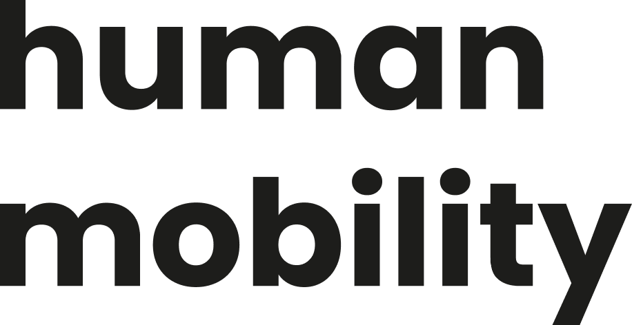
Tagline
Human
Bira aims to humanise the product and make people’s mobility closer, more sensitive and friendlier.
Mobility
It refers to mobility. It is a direct and clear way to emphasize the purpose of Bira.
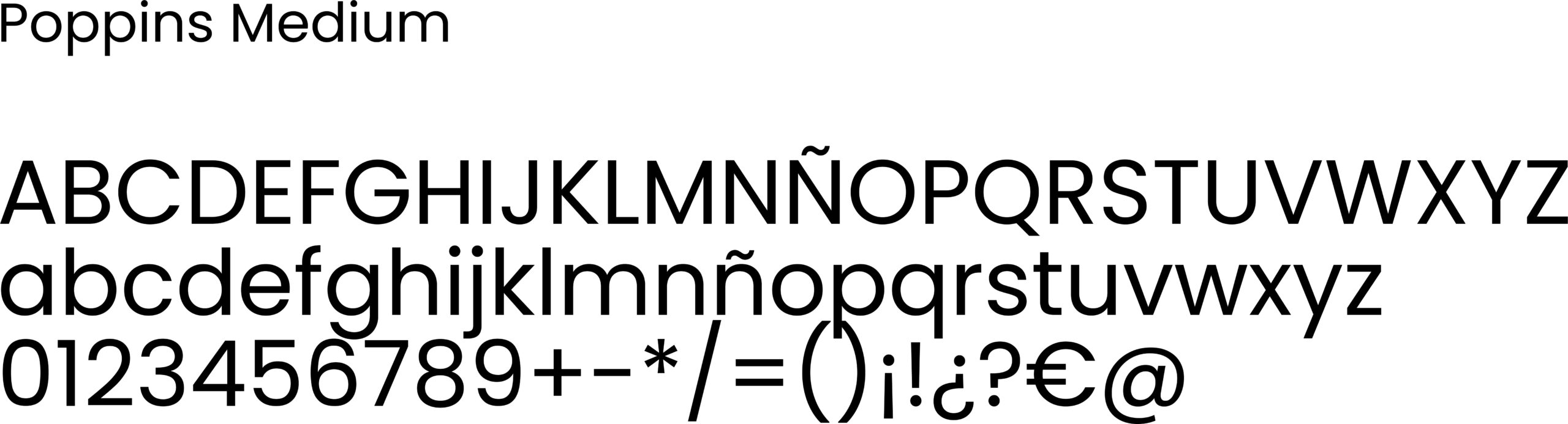
Typography
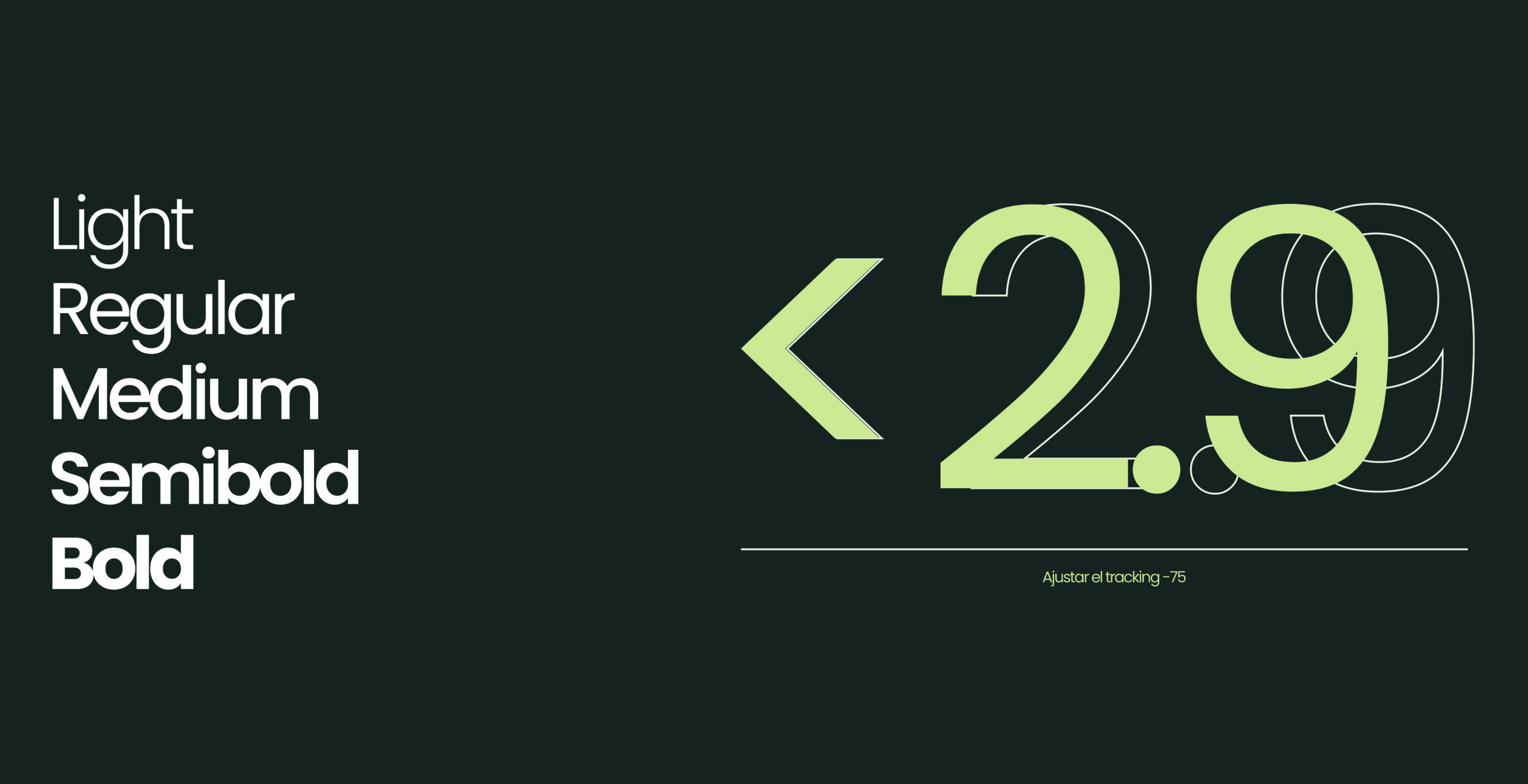
Poppins: dynamism, proximity, neatness and pragmatism.
The main typography chosen for Bira is Poppins, because of its enormous versatility, legibility and compatibility with Latin, Cyrillic and Greek, as well as with the languages of Western and Central Europe.
Graphically natural, dynamic, energetic.
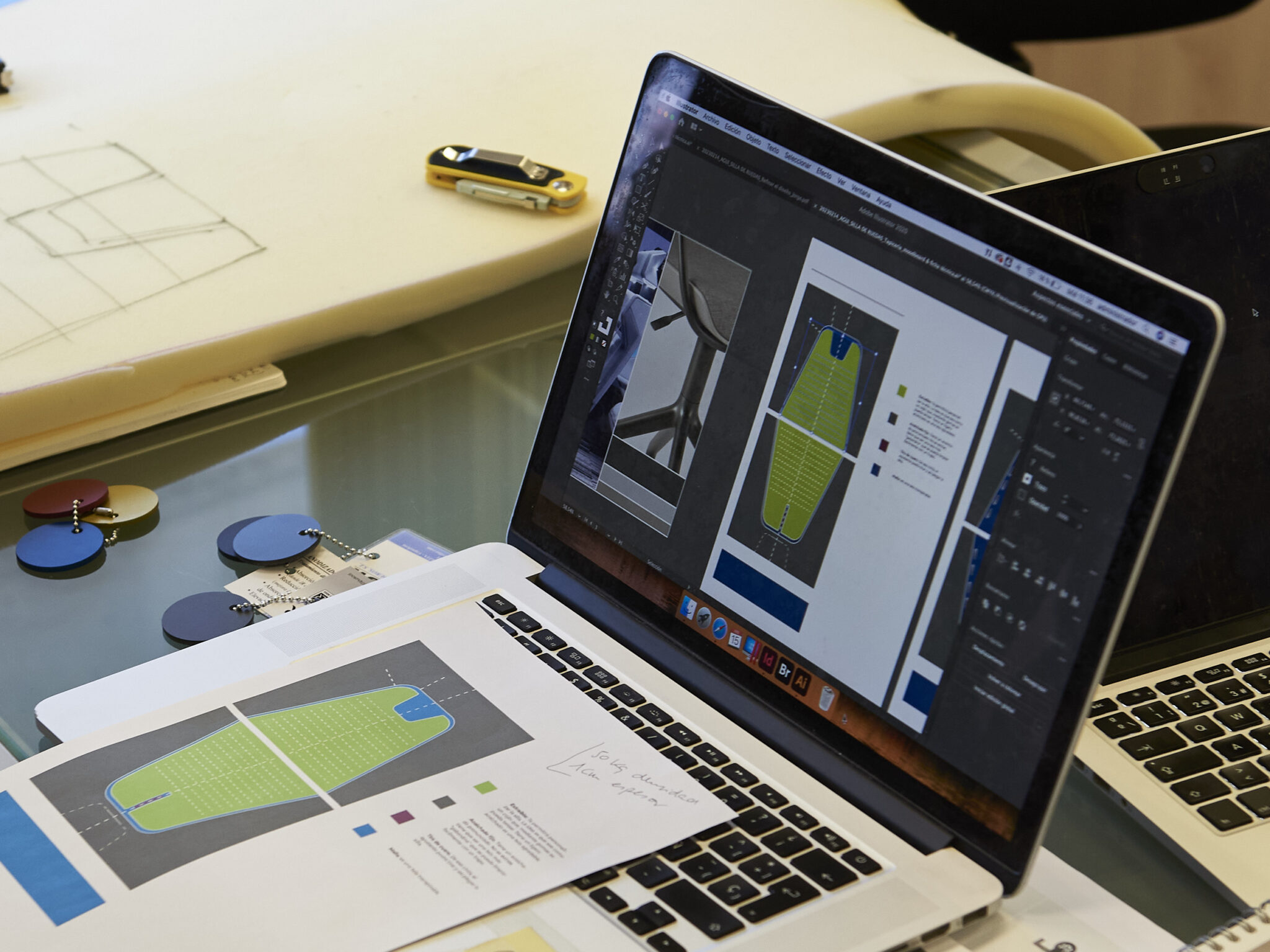
CMF strategy
Colours for both printed and digital media.
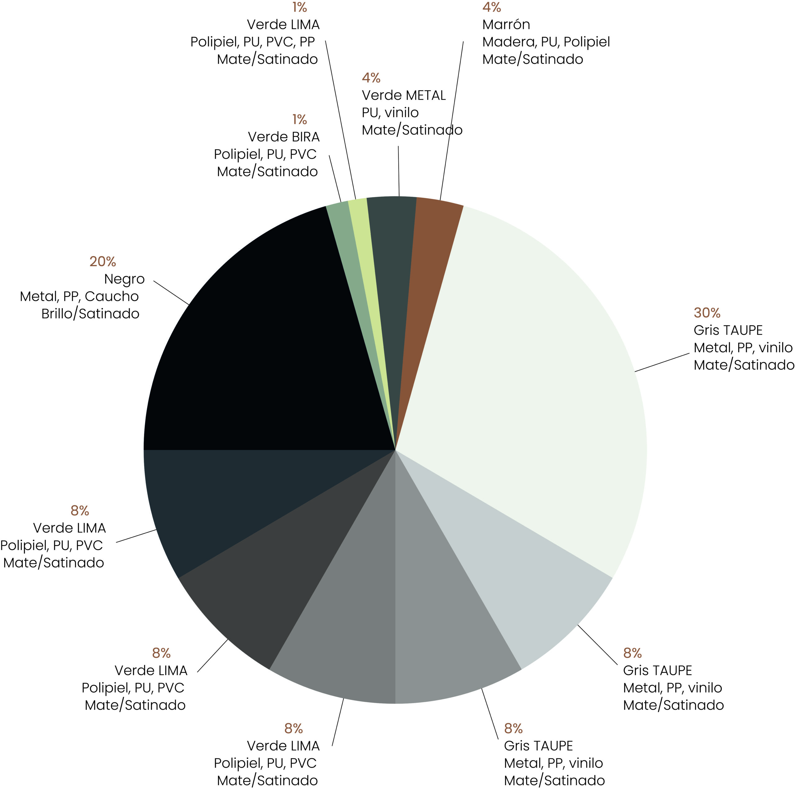
Bira’s chromatic palette is composed of three main colors: BIRA Green, CALM Green and TAUPE Gray, and several shades of each of them have been defined to facilitate and enrich their application on different substrates and make their transition smoother and more natural.
The main palette has been enriched with two accent colours, EARTH ORANGE and LEMON GREEN, which, when applied subtly, transfer strength and dynamism to each support to be designed.
Beyond colors, the definition of materials and finishes can lead to creative and often unexpected aesthetic and functional solutions. Most obey general principles of aesthetic composition and sensory experience, while others are the result of a purely functional approach.
Behind the abbreviation CMF there is a whole hidden world.
Colours, materials and finishes have been defined with a simple, minimalist aesthetic so that the brand has the ability to offer products that meet the established specifications, while striking a balance between the contemporary and the timeless.
At Nare we have contributed both in the definition of materials and in the identification of suppliers of cutting-edge technological and environmentally friendly materials.
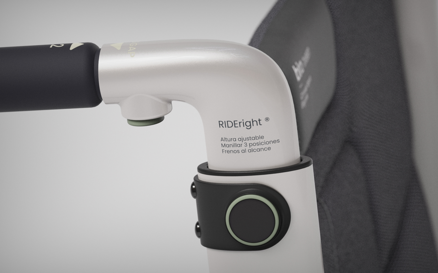
CMF as a tool of visual ergonomics.
All the mechanisms, or interaction elements of the chair, have been unified by assigning the same colour, Bira’s CALMA Green, thus creating a coherent pattern of behaviour to facilitate the understanding of how they work.
Within the chairs as a whole, where the combination of neutral and muted colours reigns, the interaction elements stand out with the colour CALM Green, directing the user’s gaze towards them, thus facilitating more intuitive operation.
Behind the abbreviation CMF hides a world.
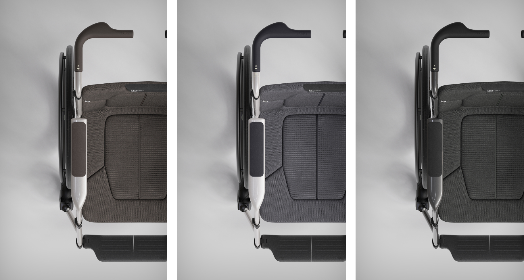
Although Bira wheelchairs already have a defined target public, with specific characteristics and needs, due to the diverse market demand, they must be adapted to other potential users in order to respond to the demands of all of them. In this way, a CMF strategy has been created to satisfy the different profiles that demand a wheelchair.
Thus, three specific lines have been devised, working with colours, materials and finishes to establish a differentiated brand language, giving a different character and focus to each of them.
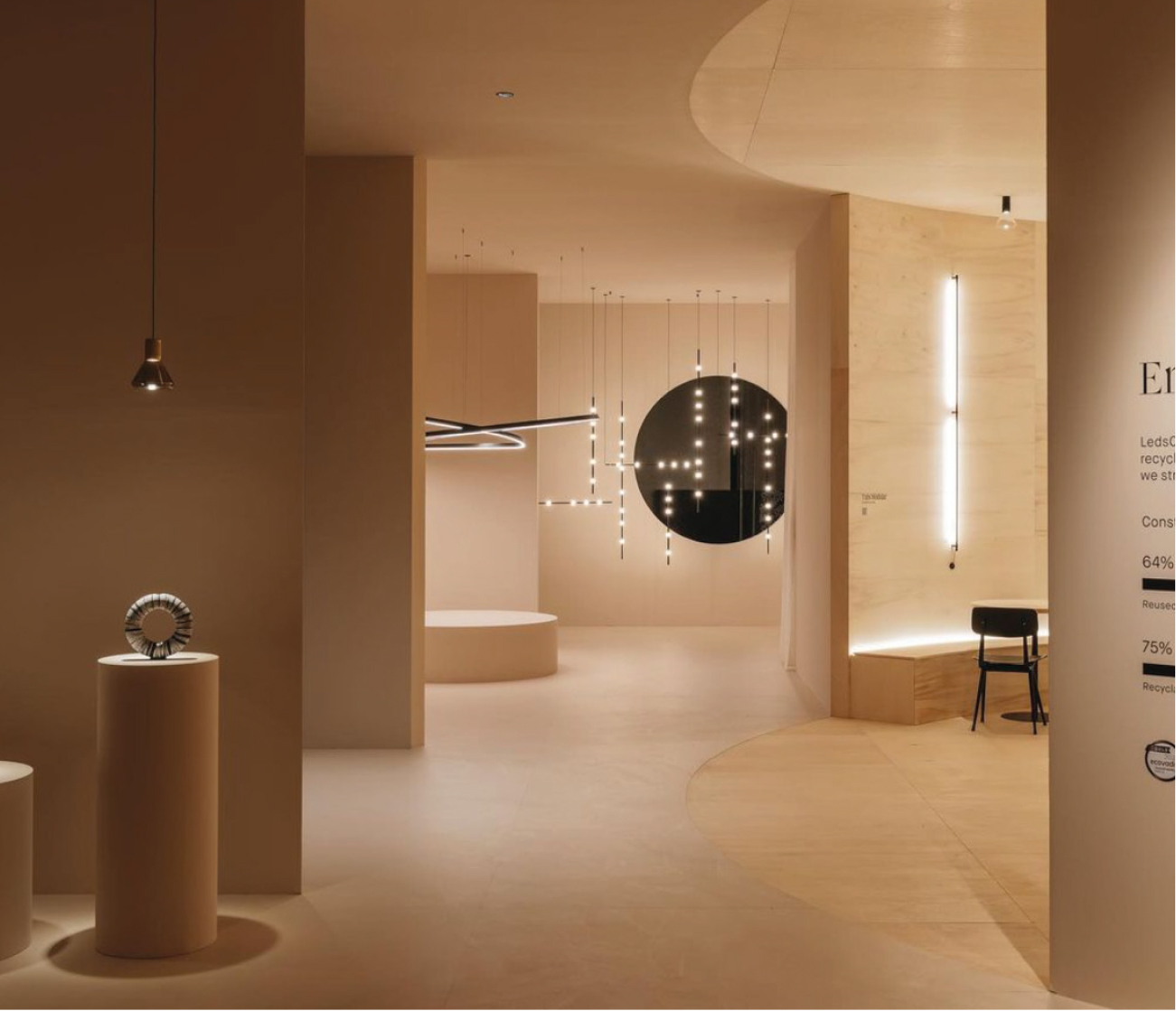
Bira Spaces
(Image credit: Courtesy Google)
(Image credit: Courtesy Google)
(Image credit: Courtesy Google)
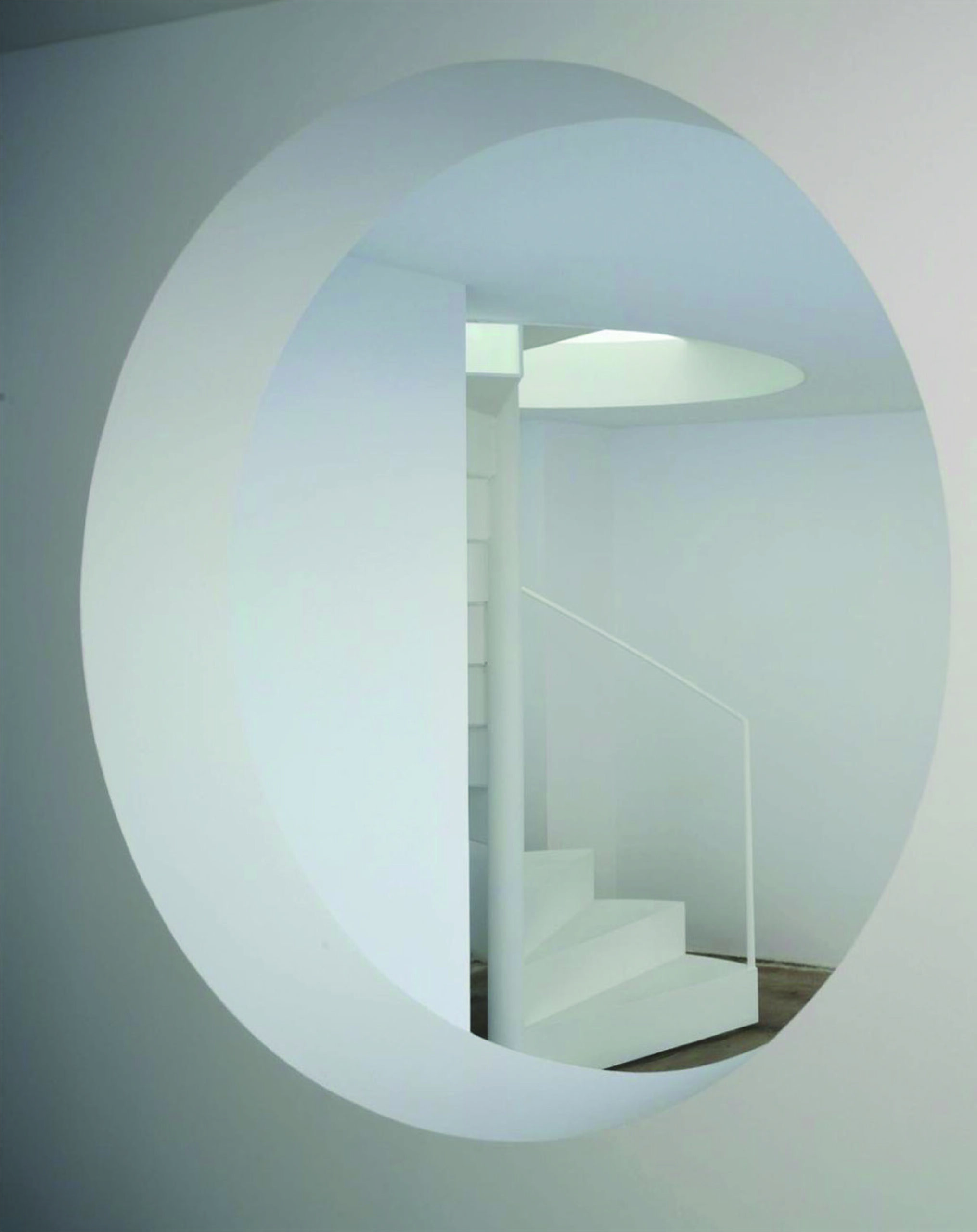
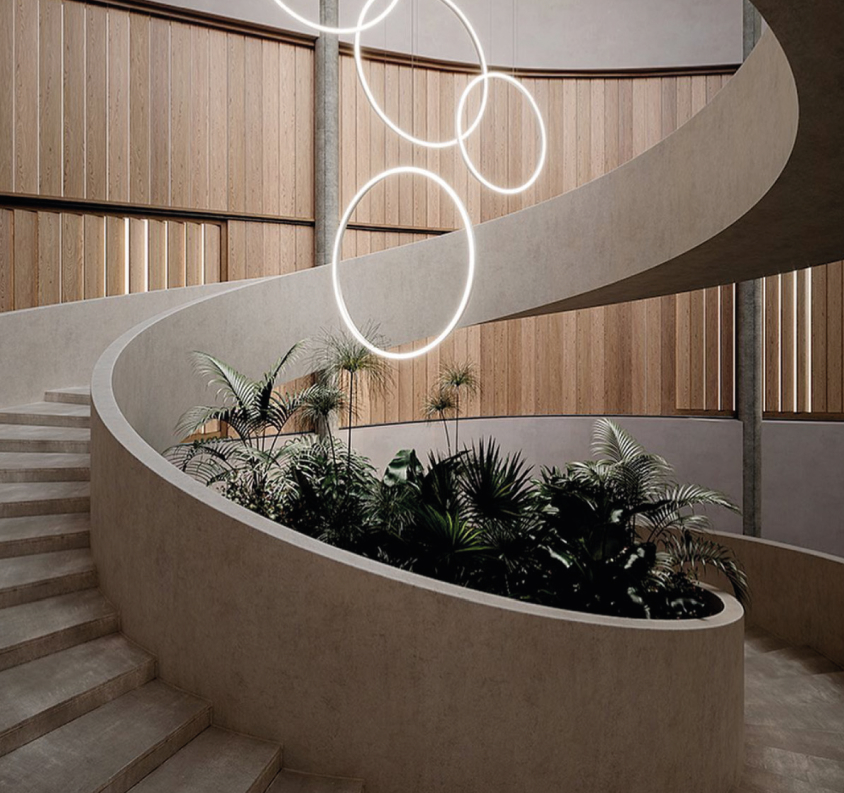
Inspirations for exhibition field projects.
In order to help the brand understand how the concept of “movement” can be integrated into their own environments, we have provided Bira with different visual examples for inspiration.