Strategic innovation Trend analysis Understanding the market Drawing up new strategies Defining user circumstances Product strategy Product design Defining the briefing Creating the narrative Ideation process Generation of concepts
Project
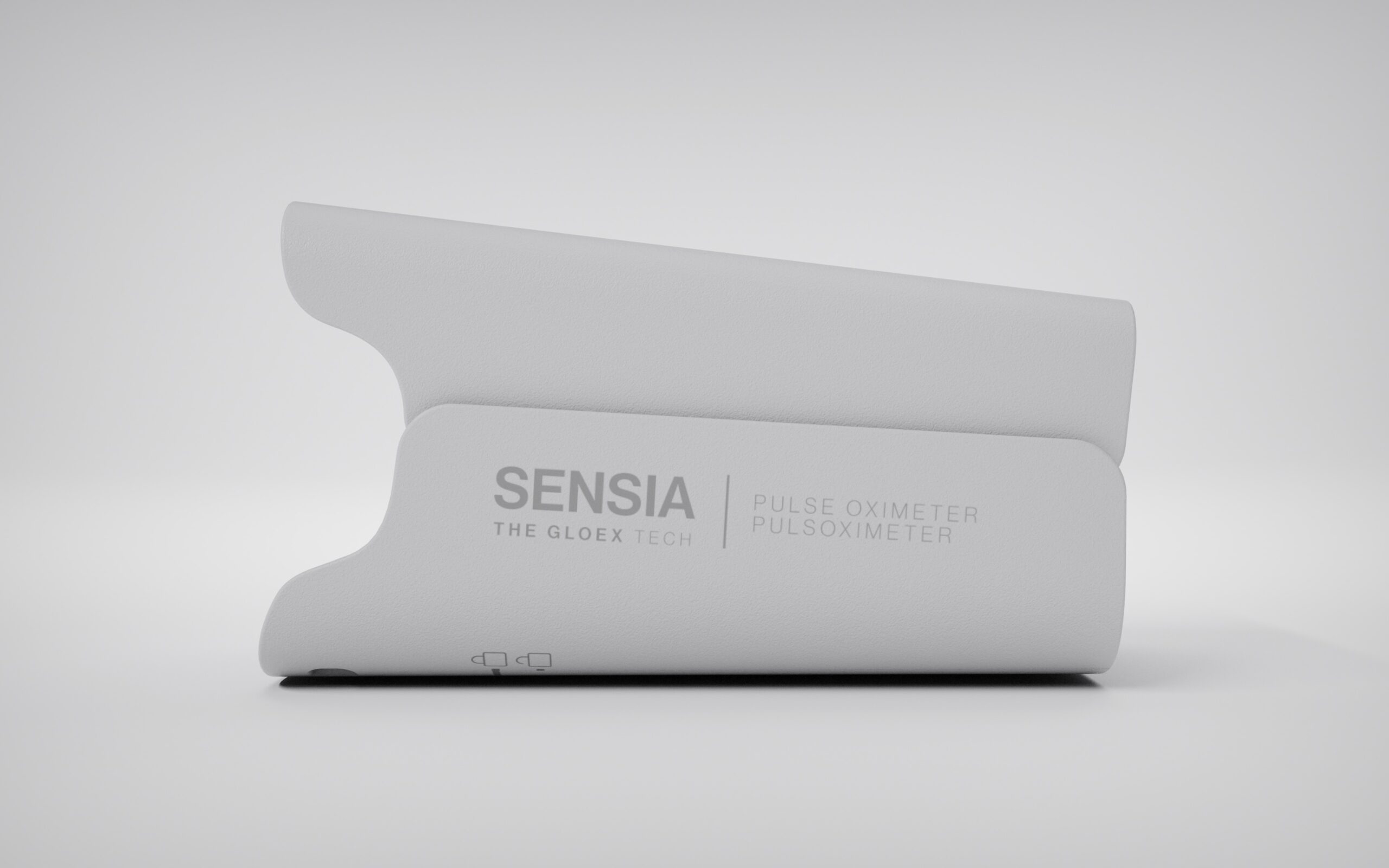
Sensia
Year
2021
Sector: Health and Pharma.
Context: Smartcare Services, a brand for the distribution of health and wellness products, has diversified its business, taking advantage of the knowledge it has acquired as a result of its experience as a distributor, by creating a new brand, with its own line of products, which it has called Wellios.
Challenge: Our mission in this project has been to design and develop the Sensia pulse oximeter strategy. Also, in order to respond to the defined strategy and ensure the proper use of the product, our involvement in the design and development of the pulse oximeter has covered both hardware and software design. Along the same lines, we have created the universe that accompanies the product: the packaging and instructions for use.
Process
Strategy
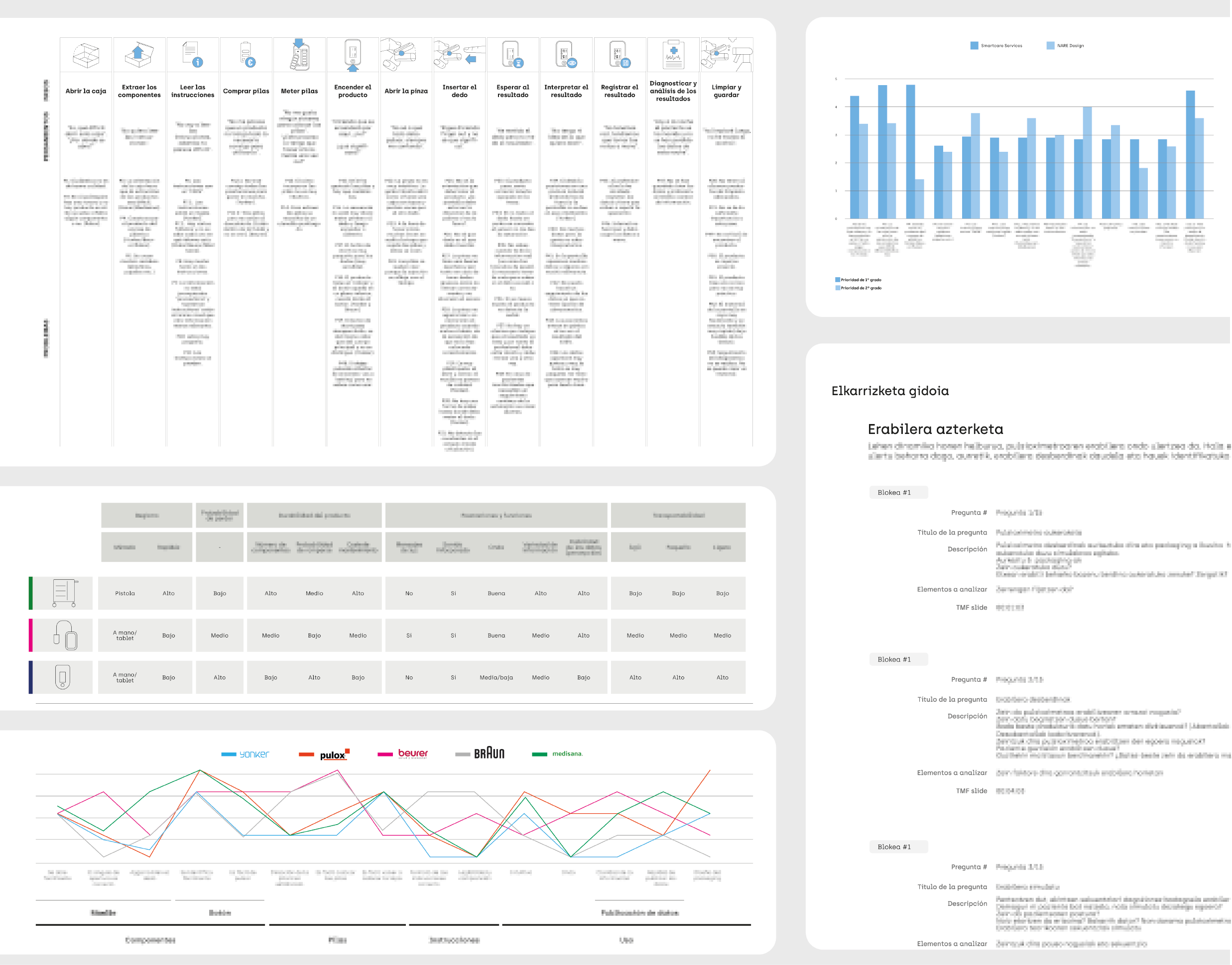
After visiting different usage environments, and through various research techniques, a better understanding of the market and its needs has been gained.
Designed with features for professionals, intended for use by senior people.
An extensive ethnographic analysis with the participation of various health profiles such as pneumologists, family doctors, nurses and COPD patients has provided us with valuable information, from which we have defined the specifications for designing a product that meets the needs of its target audience.
Our research has concluded with a number of key specifications for the design of the new pulse oximeter: portability, effortless use and easy and simple readability have proved to be indispensable attributes to take into account.
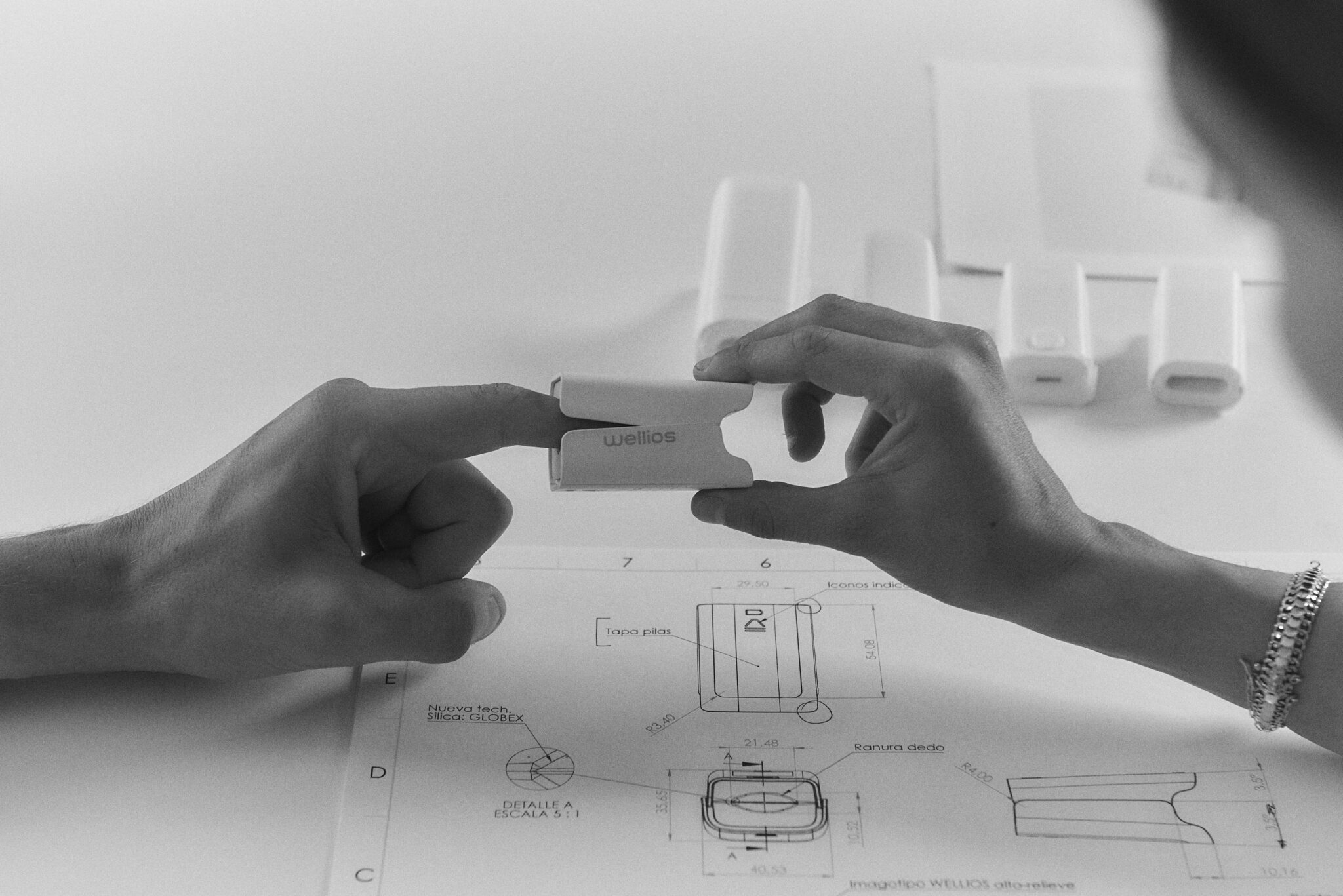
Industrial/product design
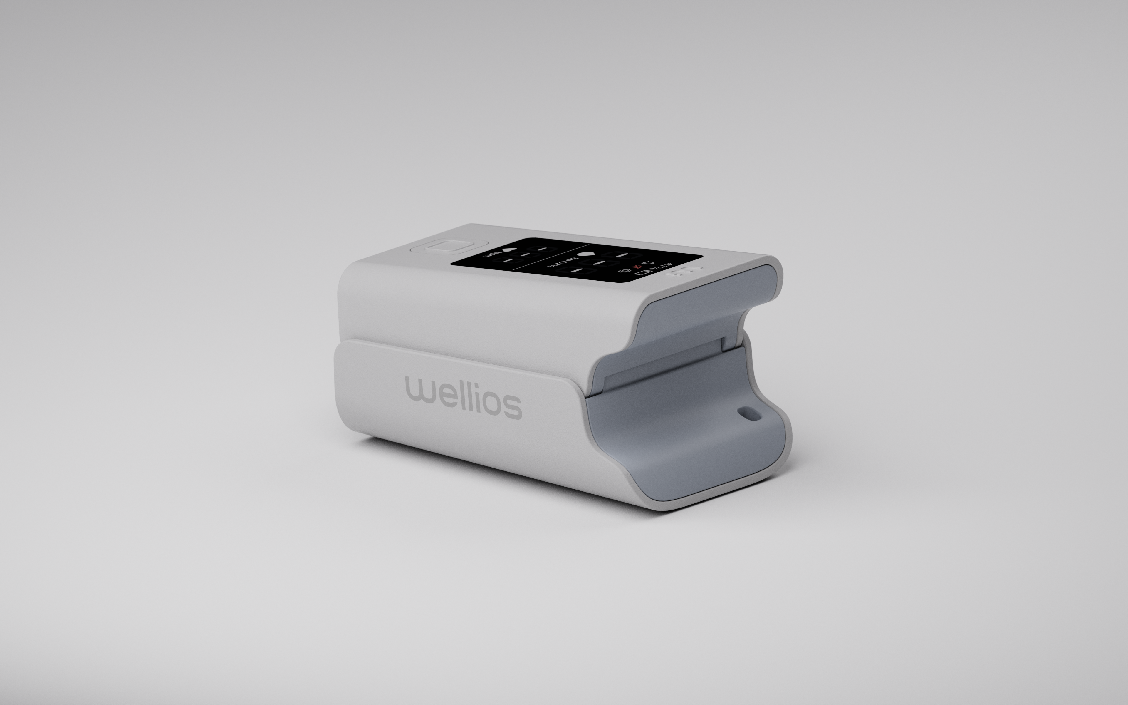
CLEAN, ERGONOMIC and HUMAN formal language.
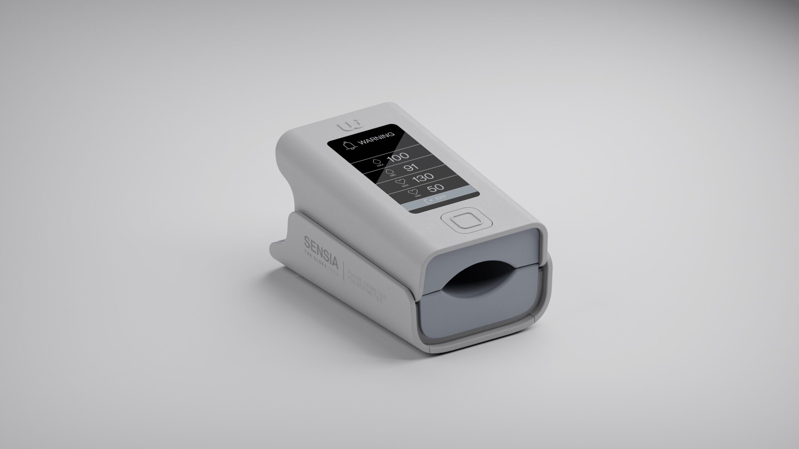
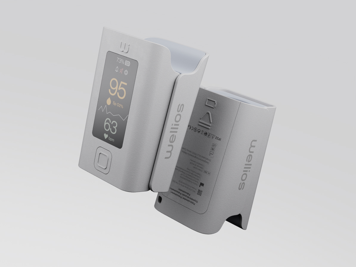
The slightly curved surfaces with rounded edges of the Sensia pulse oximeter are intelligently combined to create smooth, clean and ergonomic shapes. In addition, a language based on the user experience helps to humanize the product, making it more intuitive and enhancing the haptic sensation.
Clear and fail-safe usability.
Pulse oximeters are products used in circumstances where response time is a key factor.
Therefore, the shape and final appearance of the product are the consequence of a meticulous and thoughtful design. Thus, the main feature of Sensia is based on the reinterpretation of the “conventional clamp”, creating a new concept of pulse oximeter that improves and facilitates usability. With this intuitive feature we have managed to avoid confusions of use, such as opening and positioning.
Nothing should be arbitrary or left to chance.
Visualisation methods, creation of functional mockups and appearance models have allowed us to iterate, refining and detailing the concept.
Thanks to this information, it has been possible to verify that the product complies with the objectives set and the manufacturability specifications.
Demanding partners, quality results.
Knowing the requirements needed to turn a concept into reality allows us to achieve the highest levels of quality. During this phase of the process we have defined the specifications and design for manufacturability (DfM), in addition to leading the creative direction ensuring that all nuances are respected in order to guarantee that the final product is as faithful as possible to the original concept.
Interface
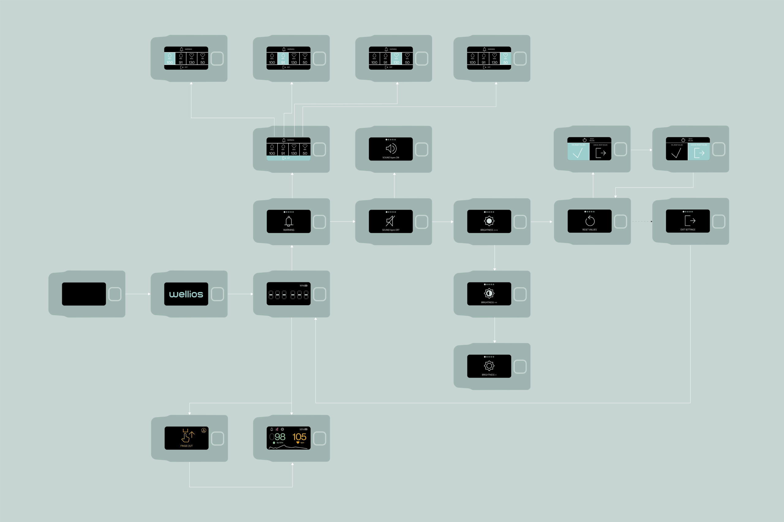
From conclusions to a new information architecture.
From the understanding of the user’s behavior, we traced the user experience (UX) process. The information architecture has been aligned with the brand’s visual identity (UI) through the creation of minimalist, intuitive and universal icons and animations that define the user experience path through wired flowcharts.
The potential of universal language.
The need to remember parameters with different conditions is an aspect that generates anxiety among COPD patients, which results in a significant increase in telephone consultations to health services. Family physicians agree that most of the telephone consultations they receive from COPD patients are aimed at confirming the correct interpretation of the results.
Therefore, the application of a universal colour language (green, orange and red) together with accompanying symbols, such as the drop and the heart, to the acronyms SPO2% and BPM helps patients to interpret the data effortlessly and removes doubts.
Vertical and horizontal reading.
After an analysis of competitors’ products, together with research and contrast with target customers, we concluded that the possibility of both horizontal and vertical reading is an indispensable specification that adds value to the product. This attribute makes the display oriented to the user, making the readability of Sensia equally comfortable when reading by the patient as by family members and/or professionals.
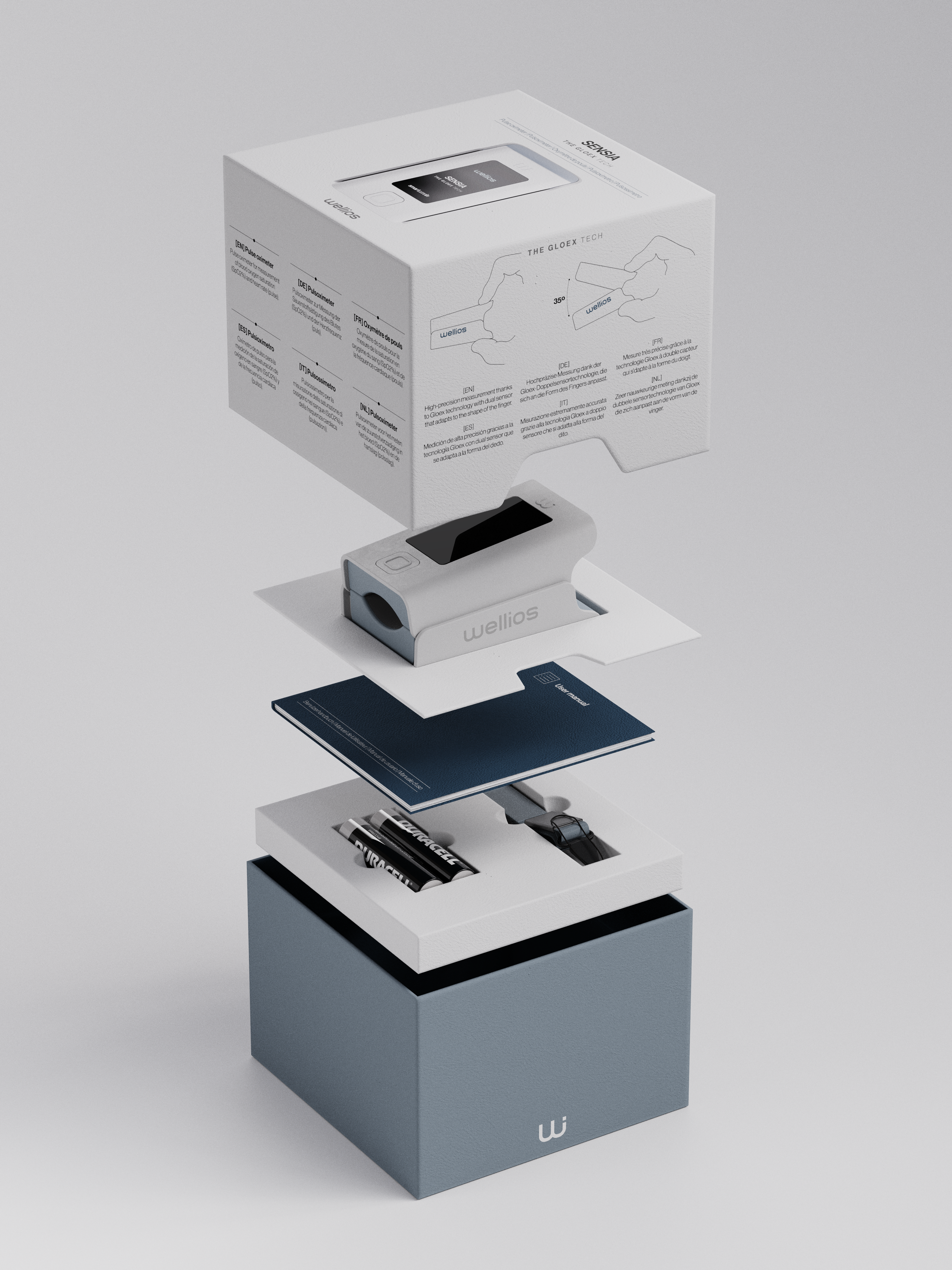
Packaging
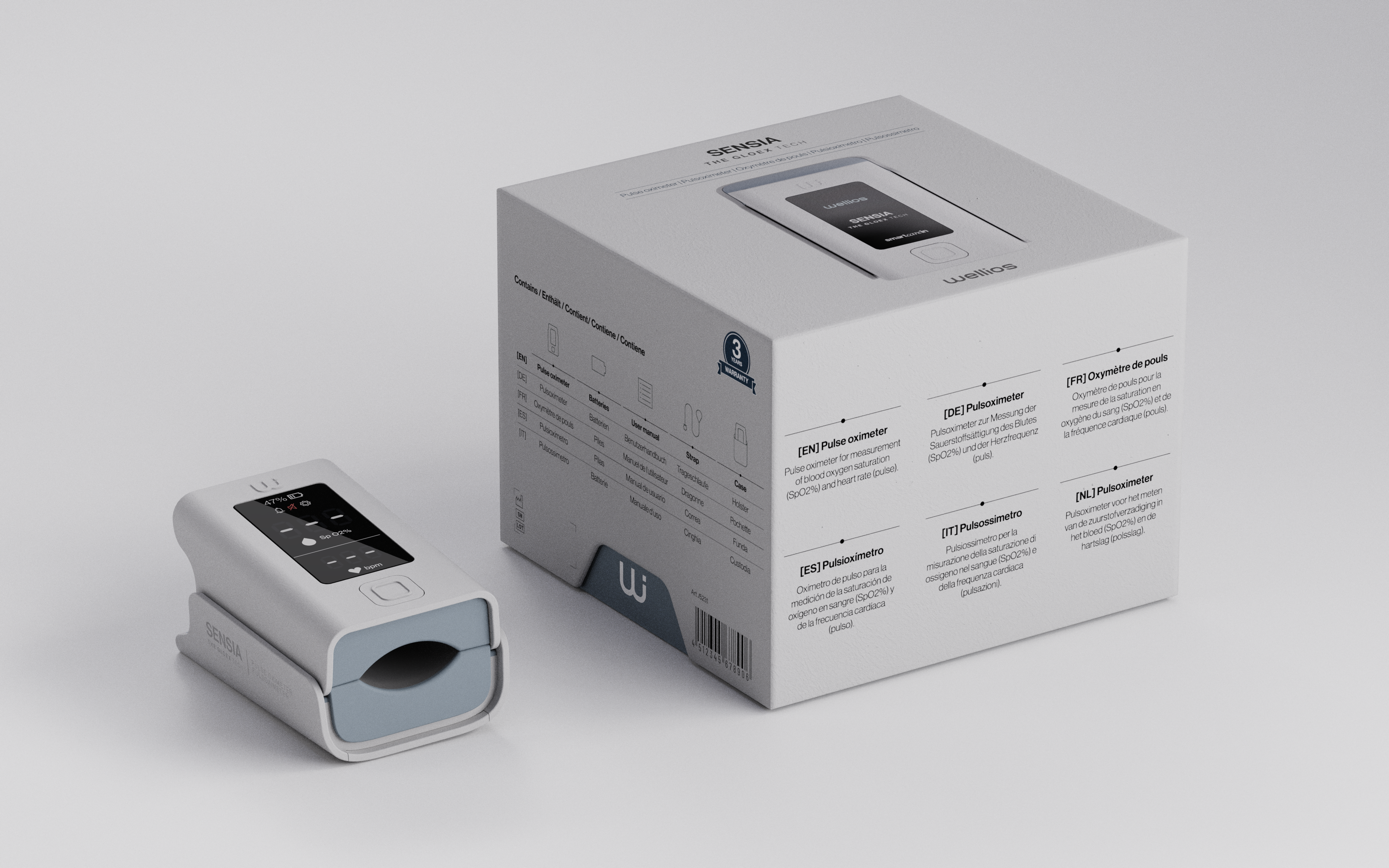
Unboxing is the first physical point of contact between the brand and the customer.
The essence of Sensia has been transmitted to the packaging
Each element has its own holder to offer a specific display space and sequence. Its intuitive assembly system gives the customer an easy experience, as each element, highlighted by icons and perforations, is stored in a specific place on the packaging.
The guidelines of the brand’s visual identity have been respected in order to consolidate it, designing all the packaging content (icons, graphics and texts) following the brand’s graphic style.
The packaging also gives a wink to the product by using the accentuated shape of the ‘gripper notch’ for the bottom opening of the box.