Brand strategy Naming Verbal identity Visual identity Art direction
Project
The best version of the sun
Year
2023
Sector: Renewable energies.
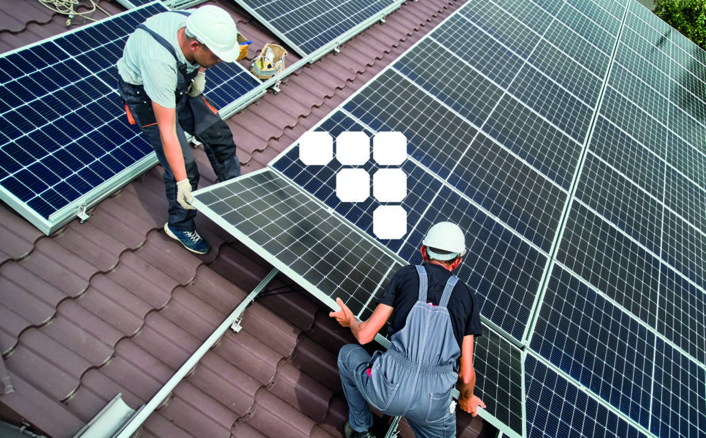
Context: Zuia has more than 15 years of experience in the renewable energy sector, positioning itself as the leading company in photovoltaic self-consumption.
The renewable energy sector is experiencing accelerated growth, which means the emergence of more and more companies, among which competition has become fierce. This scenario, marked by new market demands, has meant that brands need more than ever to have their own personal identity.
Challenge: The objective of this collaboration has been to define and communicate its value proposition and competitive advantage, through a brand strategy adapted to the situation.
To this end, we have developed a brand narrative aligned with this strategy and have worked on a new identity that, supported by various media, brings meaning and clarity to its complex work process in order to respond to the growing demand with greater confidence and solidity.
Process
"In a society with a strong environmental awareness but with a great lack of knowledge about the solutions that renewable energies can offer, accessibility, proximity and professionalism are values that are more necessary than ever when communicating services."
Narrative
Three concepts, one story.
Zuia strives for excellence and, therefore, every detail counts.
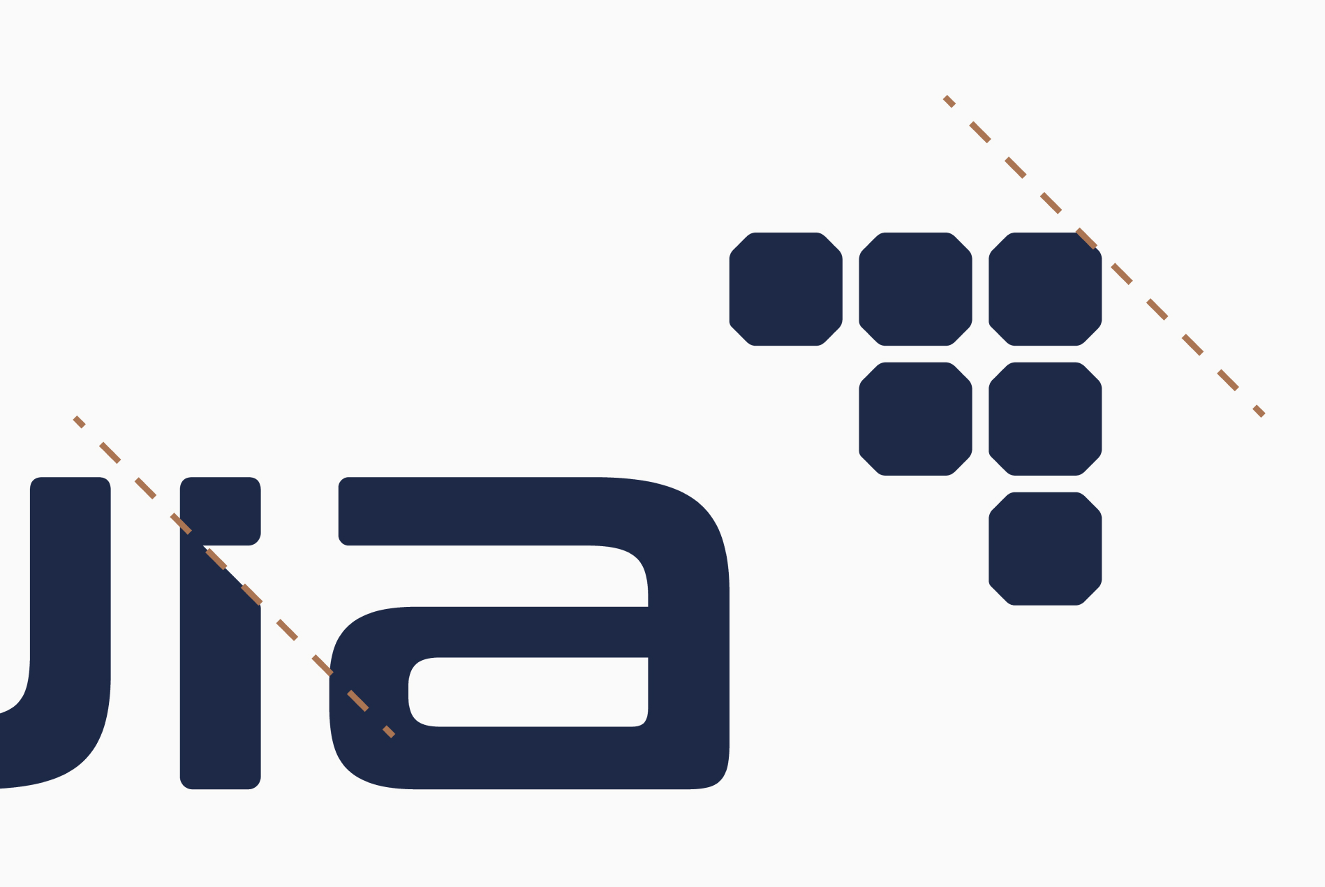
Based on the main concept of its logo, the photovoltaic cells have been redesigned to increase their level of detail and give them a more realistic appearance.
The representation of the photovoltaic cells has also been represented by creating a diagonal arrow, this being the vector between an arrow pointing upwards and an arrow pointing to the right.
The arrow pointing upwards represents the savings, efficiency and performance of its solutions, while the arrow pointing to the right conveys its ambition for innovation, progression, commitment to quality and continuous improvement.
Imago
Wordmark
We have managed to increase brand recognition with the attention to detail in the creation of this visual identity. The choice of typography for the wordmark together with the customization of the elements that compose it, allow the brand to tell the story that reinforces its positioning.
The inclined junction of the letter “i”.
The chamfer of the plates of the photovoltaic cells has been replicated to join the body of the letter ‘i’ and its point, thus simulating the union between Zuia and the main manufacturers of photovoltaic plates.
Chromatic range
Security, seriousness and commitment represented through the colours.
The projection of the strategy has been reinforced with a chromatic line based on blues with a new, more sophisticated air that enhances the brand’s technology and tradition. In this way, a color palette based on the renewable energy engineering segment has been defined.
The blue has been complemented with an orange color to represent the company’s socio-environmental values. This highlighting color has been given a coppery hue, referring to the copper of which the cables are composed and which is an indispensable element in the conduction of photovoltaic energy.
Tagline
“La mejor versión del sol” (“The best version of the sun”): Zuia’s ambition in the renewable energy sector.
“The best version” represents Zuia’s commitment to its customers by referring to its commitment to excellence and its ambitious nature.
“Del sol” refers to the sector in which Zuia operates. It is a metaphorical way of alluding to “solar energy.”
Typography
It is a strong and versatile typeface that allows for easy application across different media. Created by Jullieta Ulanovski, it is inspired by old posters and traditional signage. At the same time, its contemporary and timeless design ensures its relevance, achieving a balance between the innovation and tradition that Zuia draws upon.
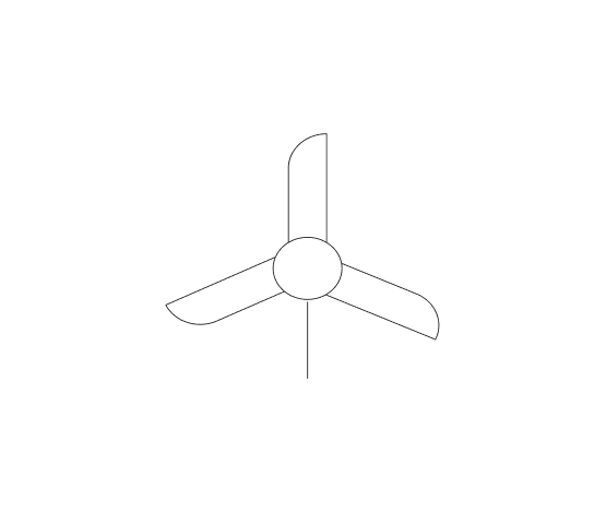
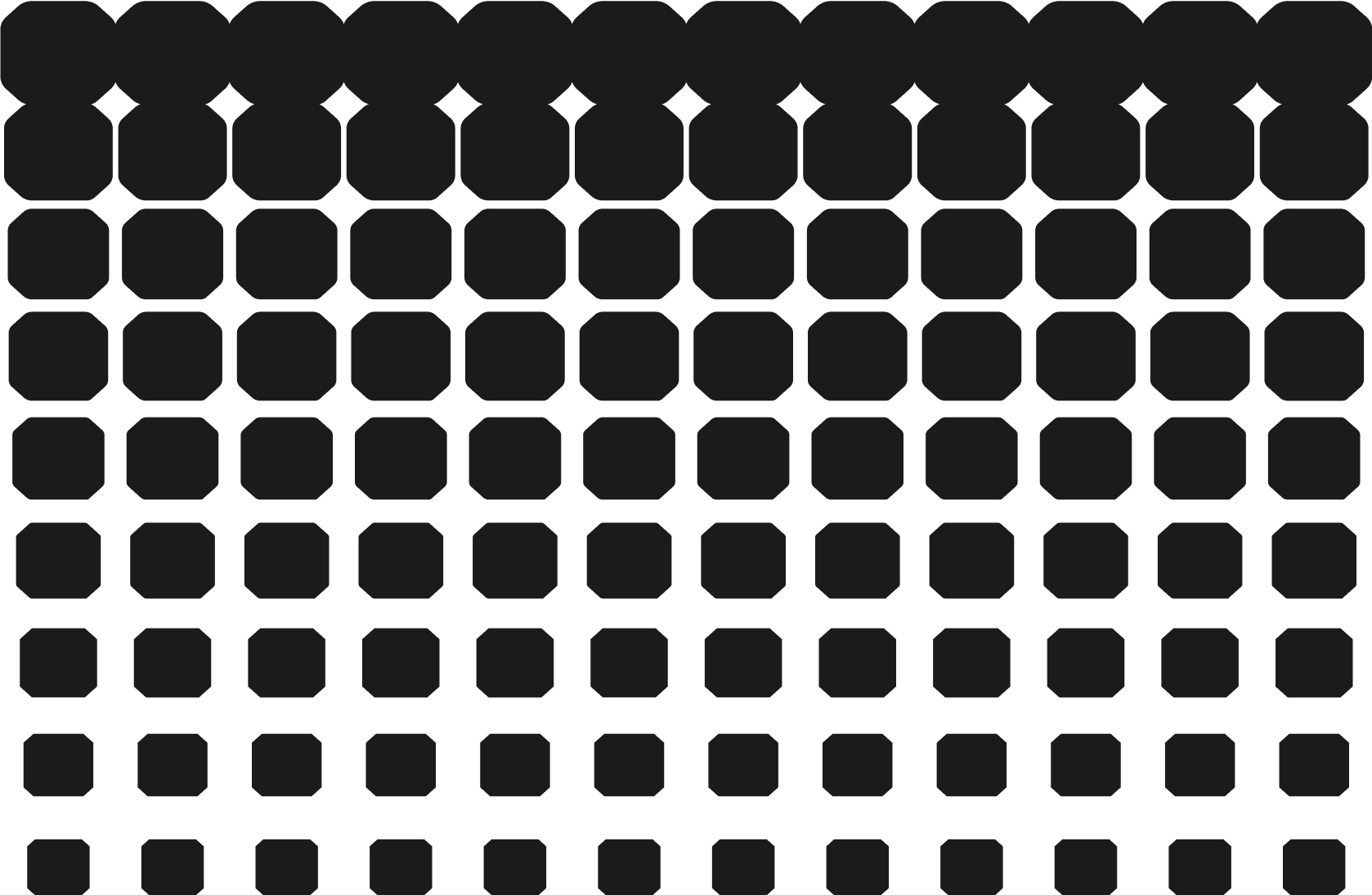
Pictographs
Static graphic
Graphically correct, accurate, square.
Dynamic graphic
Graphically natural, dynamic, energetic.
Through the combination of the main elements worked on and their implementation in the different physical and digital touch points, we have obtained as a result a strong, coherent and aligned image with the purpose and positioning of the brand.
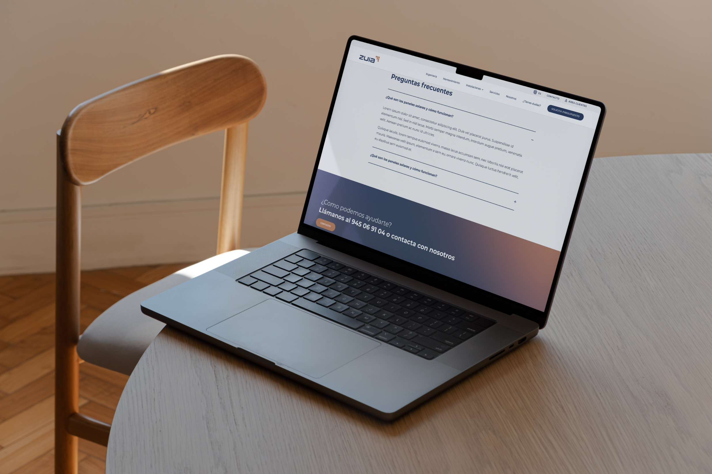
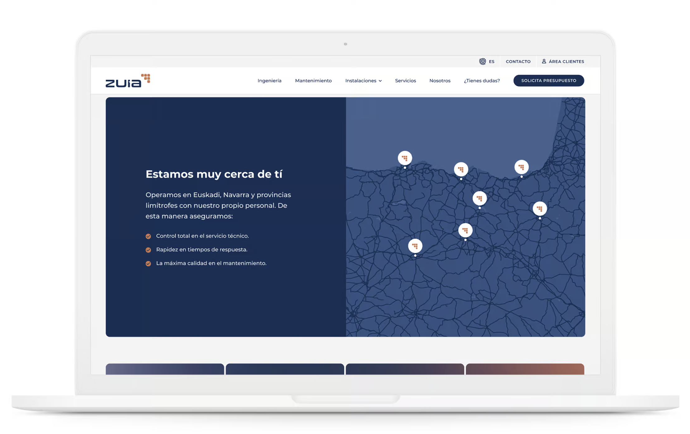
Digital platform
From Nare, we have designed a digital proposal focused on elevating the brand and product experience to the next level. All of this is in response to the company’s positioning and long-term strategic direction.
The new digital platform respects and applies Zuia’s new brand identity in a solid and coherent way, making it easier for users to navigate.
The value of proximity.
The new strategic design of the website allows Zuia to communicate its value proposal in a direct and simple way.