Brand Strategy Brand Identity CMF Strategy Product/Industrial Design Visualization Art Direction
Project
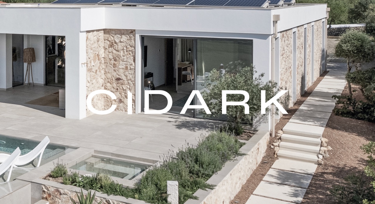
We build spaces
Year
2024
Sector: Industrialised and modular construction.
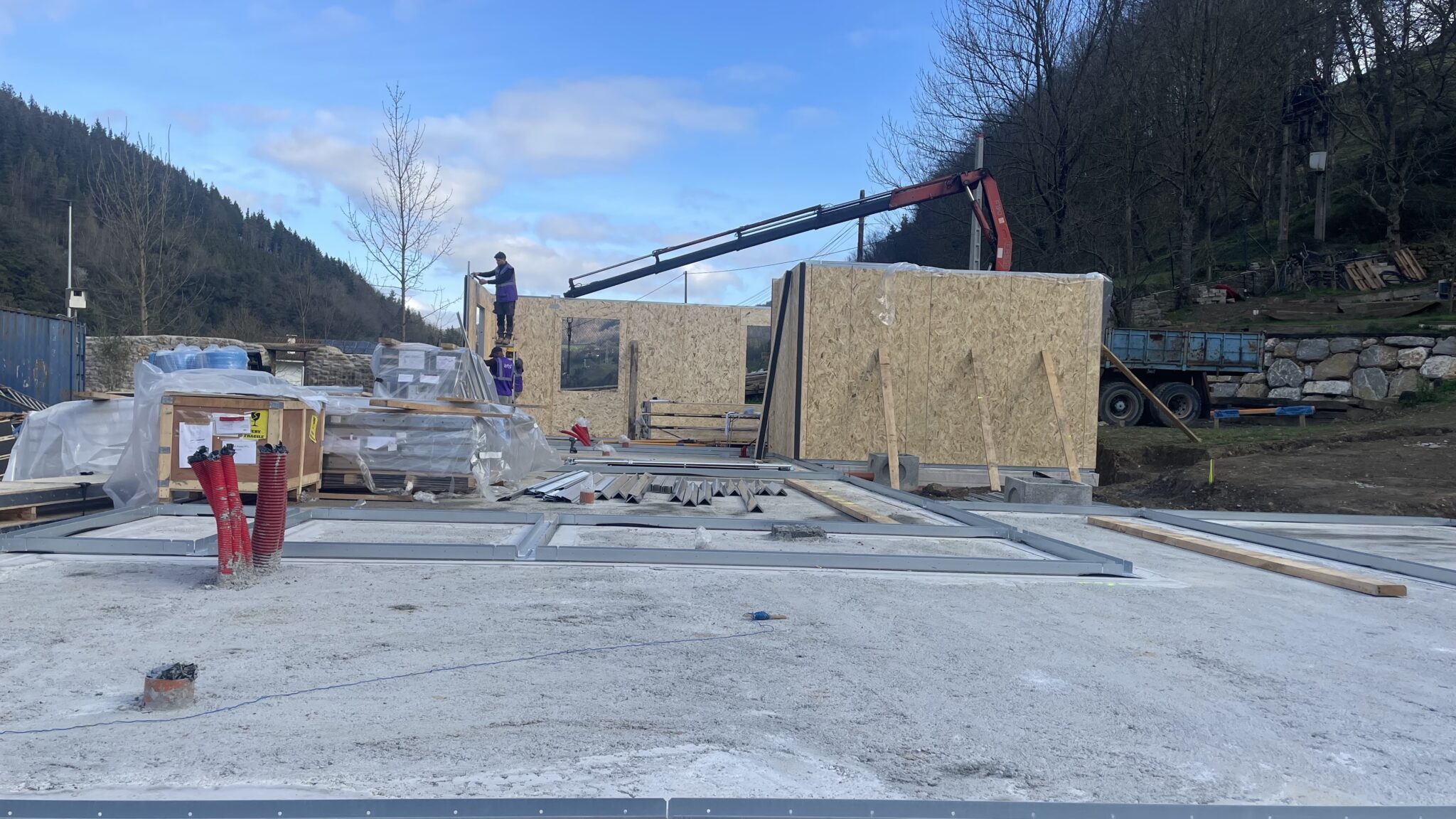
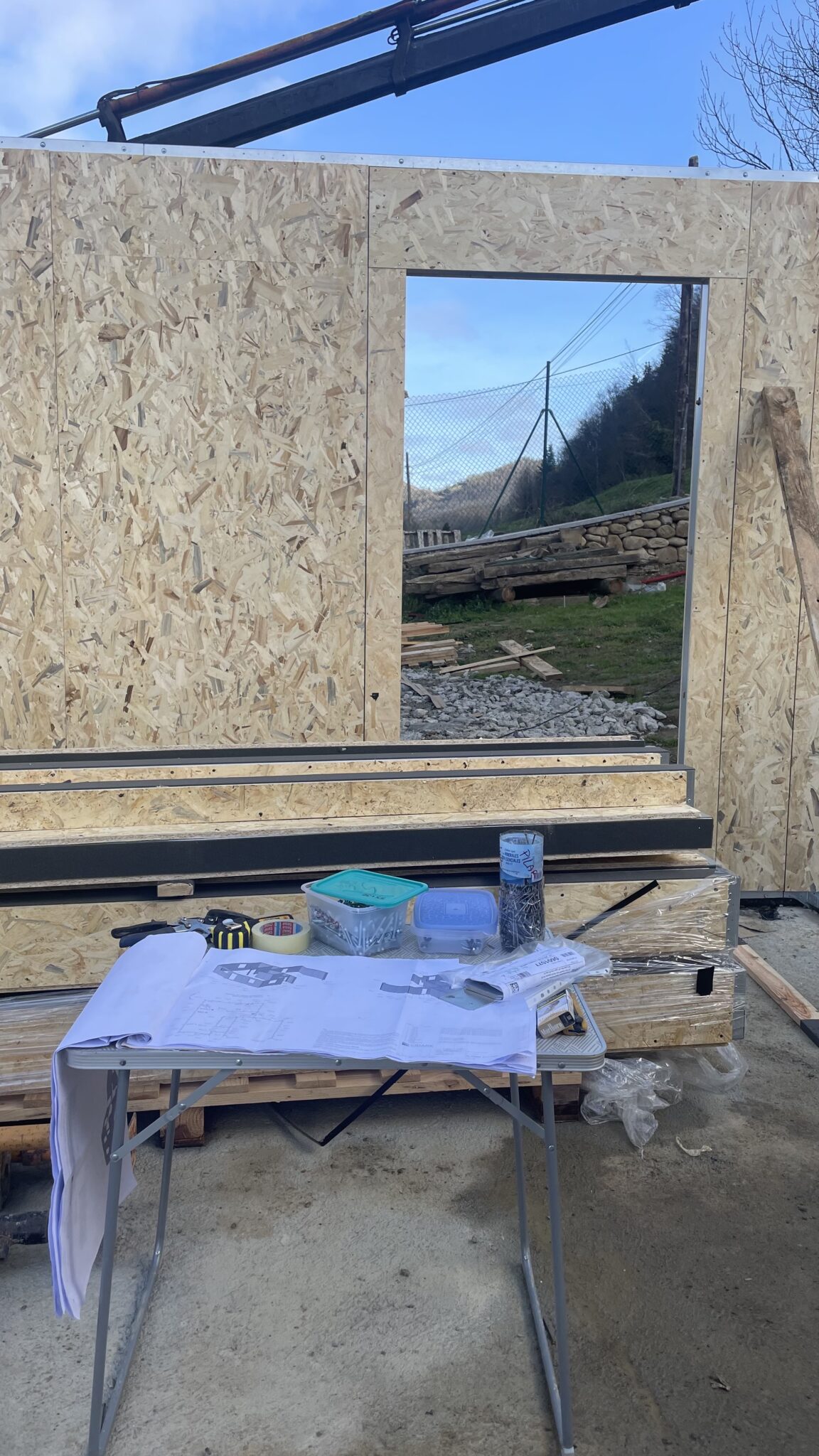
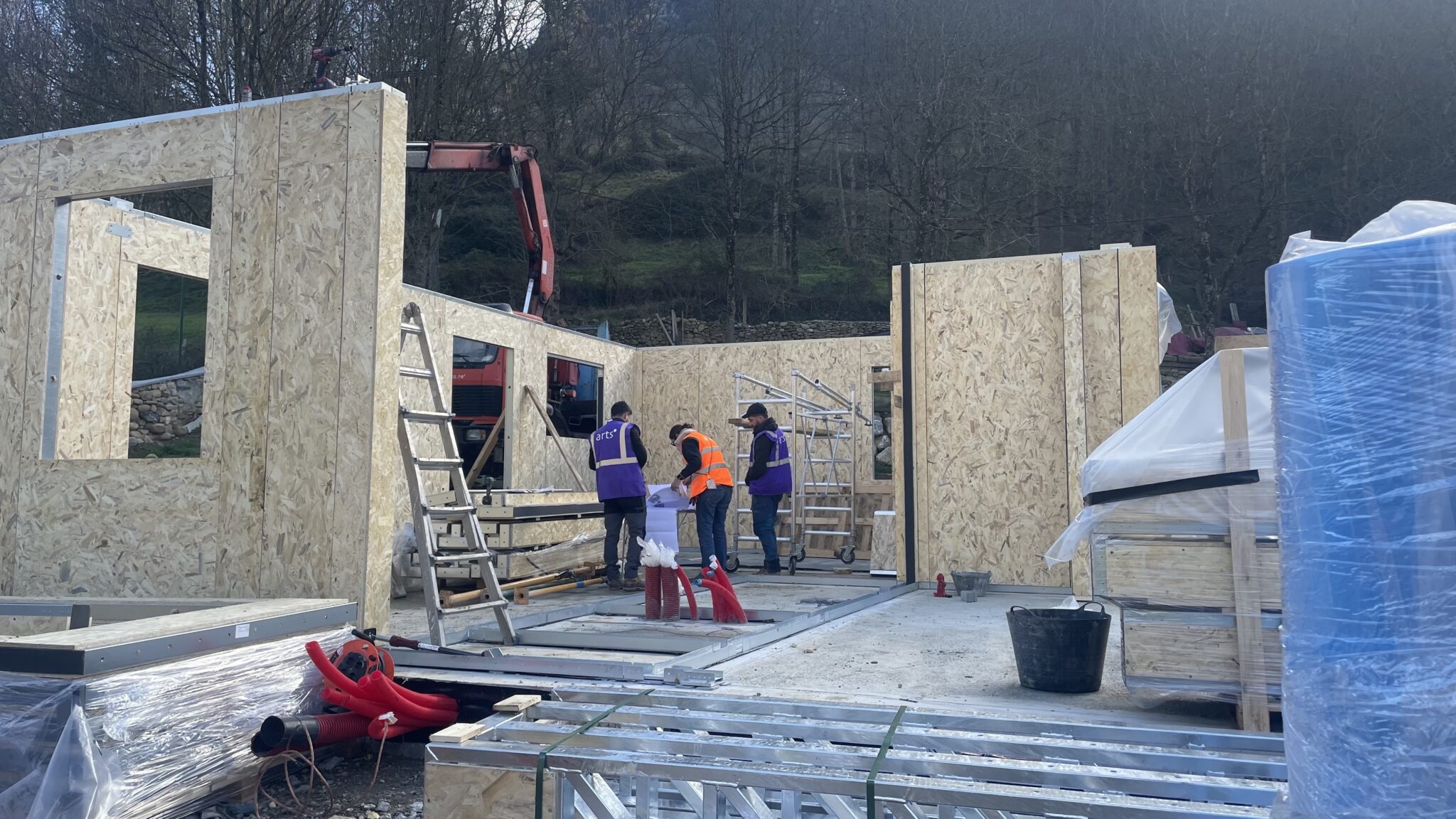
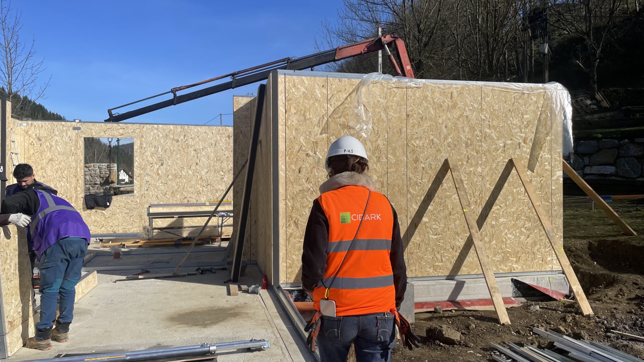
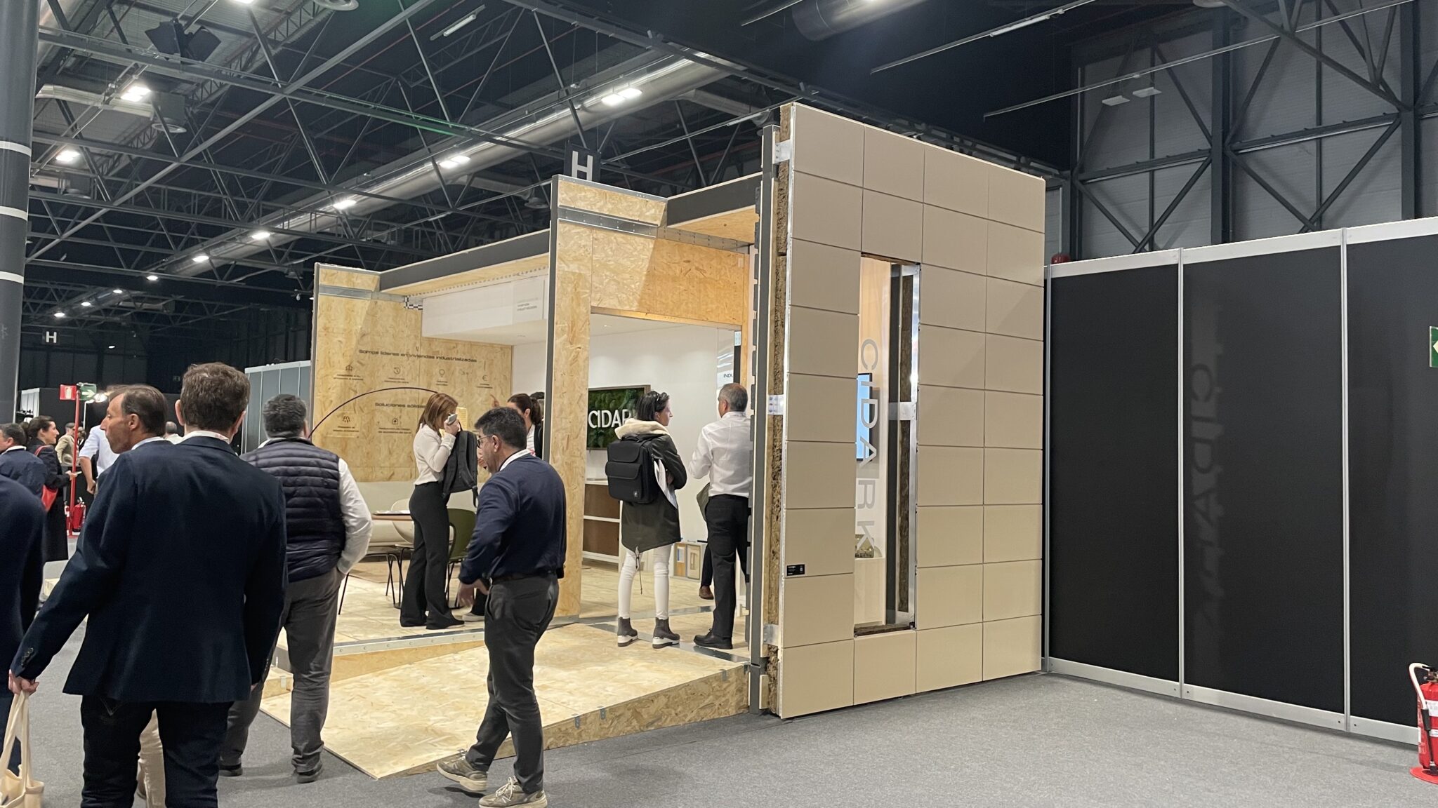
Context: Cidark is an industrialised and modular construction company. Its innovative construction solutions and its commitment to the environment make it a brand pioneer in its sector. Its revolutionary construction system, based on the ‘P3 System’ technology, makes it possible to get the most out of the transport and assembly process, optimising costs and significantly reducing conventional construction times.
Challenge: At Nare we have defined the company’s brand strategy. Our objective: to define and represent Cidark’s differentiated vision in order to communicate its value proposition and its true essence in a direct and simple way, thus enabling a more effective and affective connection with its target audience.
Process
It has taken several visits to projects under construction and management meetings to grasp the true essence and reality of the company. This deep understanding of its context has helped us to define the entire strategic platform of the brand; a platform that will act as a lever for the definition of any element that builds the brand, guaranteeing coherence and reinforcing its identity.
Narrative
“The rudeness of the construction and the warmth of the home”.
Based on the new brand platform defined by Nare for Cidark and with the aim of building a prestigious image, we outlined an own identity far from empty discourse. Therefore, we opted for an honest and meaningful brand idea that perfectly represents Cidark’s philosophy.
In a sector where the coldness of industry and the intimacy of a home coexist, it was essential to find the harmony between these two aspects that would allow Cidark to stand out with a unique approach.
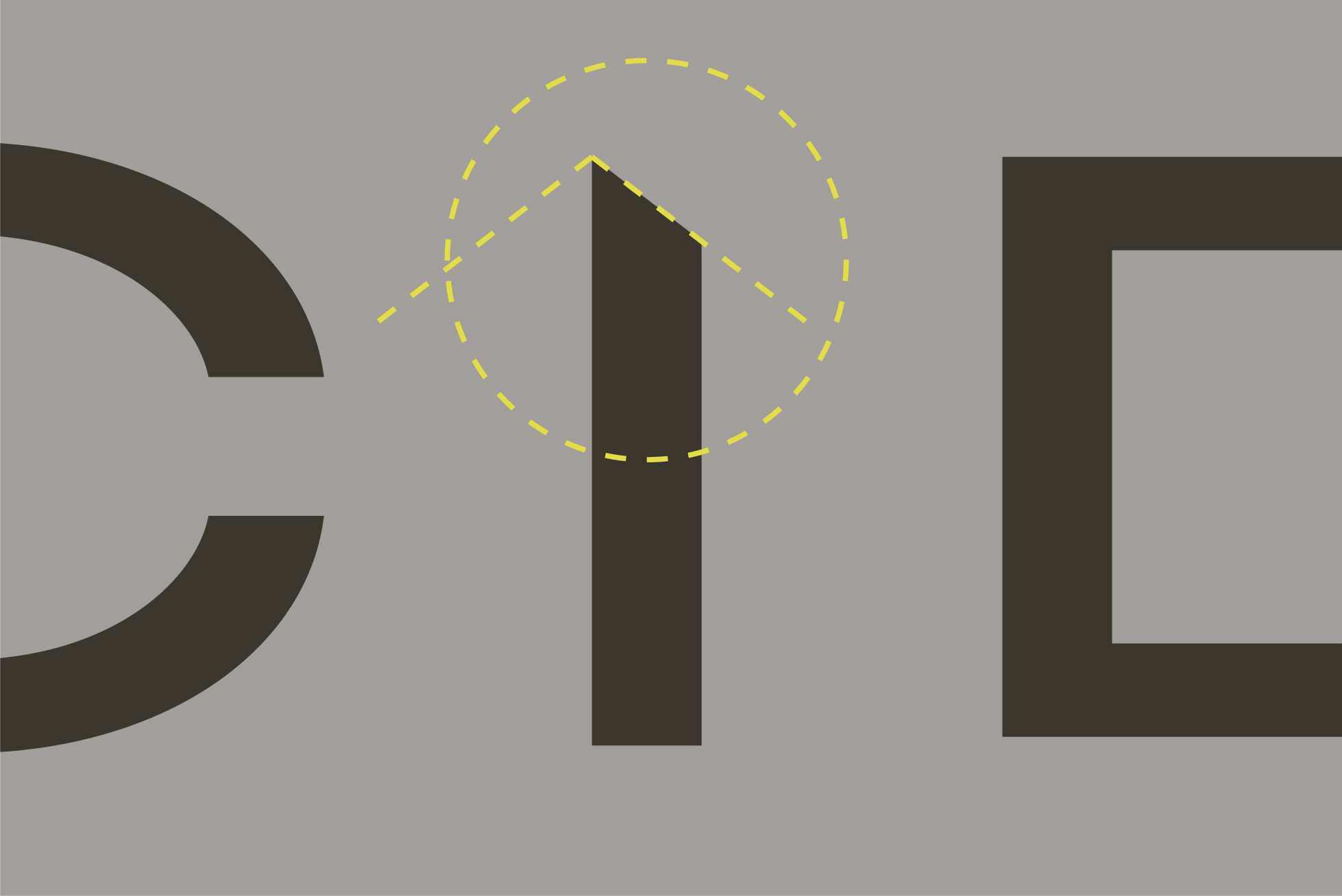
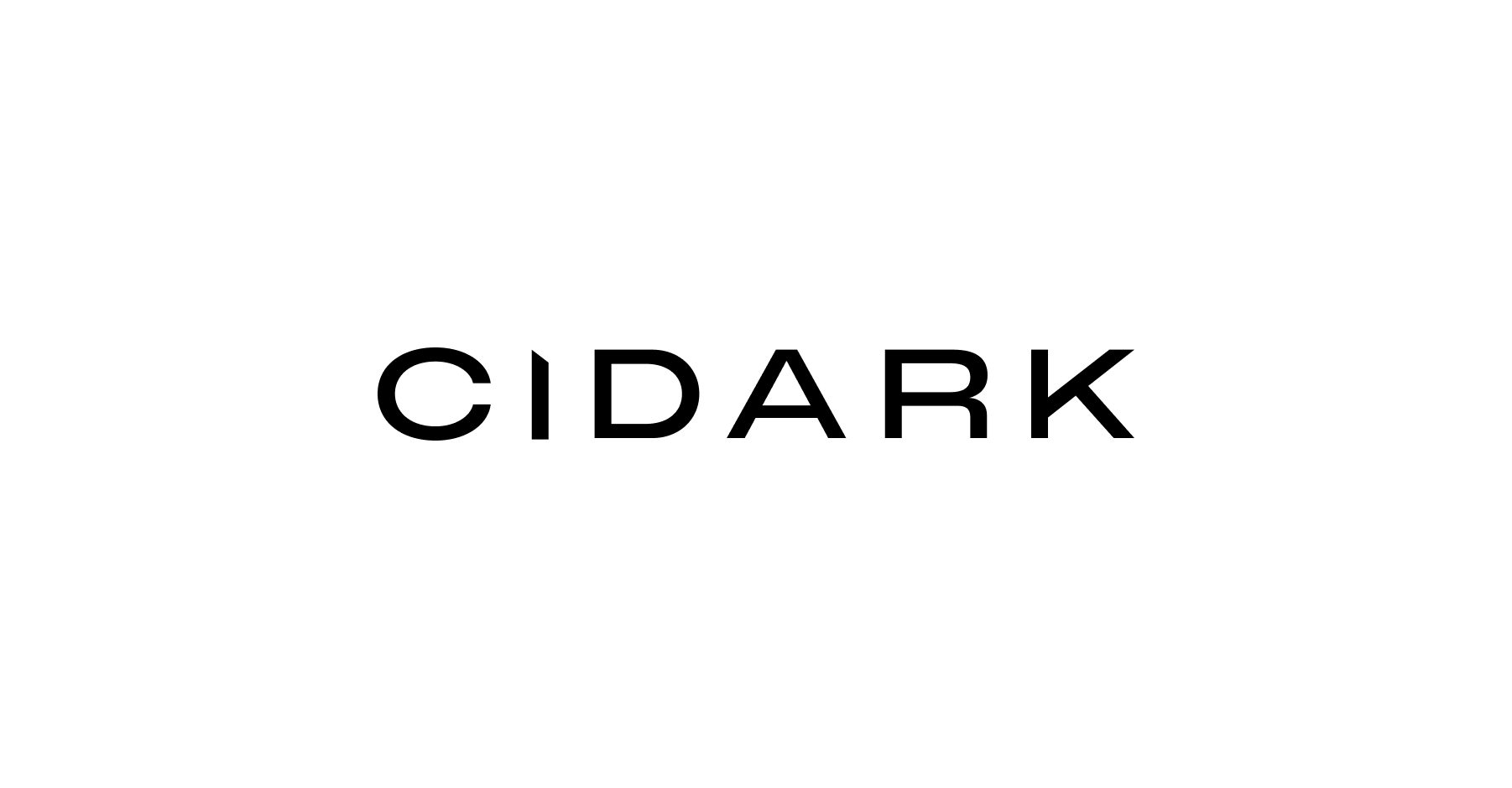
Wordmark
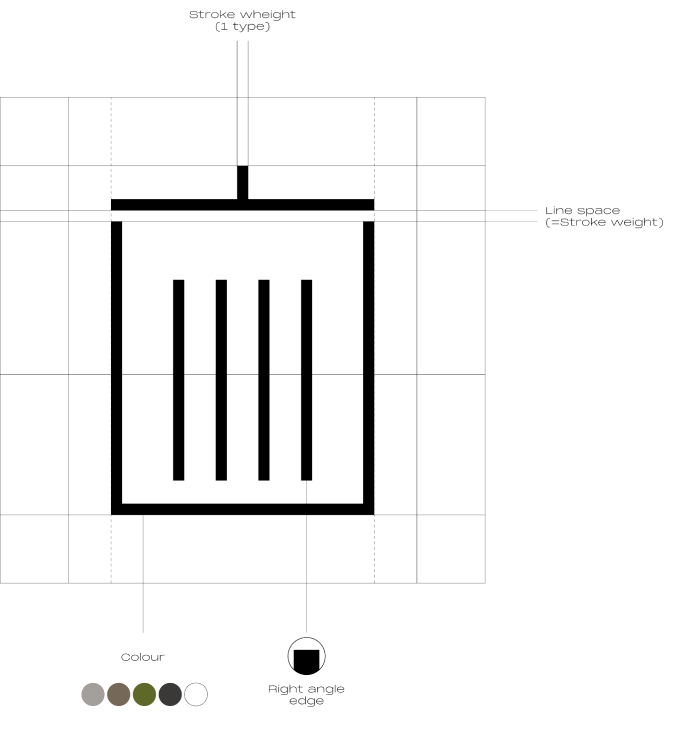
First wink to its “P3 System” solution.
The brand’s greatest differential value lies in its ‘P3 System’ solution, a modular system that allows greater construction flexibility than the rest of the competitors. The fusion of this differential value (proprietary technology) with its purpose of building customised spaces and homes has been the perfect germ for carving out the brand narrative.
The cut-out letter ‘i’ takes centre stage in the wordmark and, as it is the central symbol of the brand, this feature gives it its power, projecting inspiration and optimism in an industry that suffers from a one-sided approach. The implementation of the letter ‘i’ as a symbol enhances the narrative and reinforces the brand’s memorability.
Imago
Tagline
As well as needs, the spaces that are built have different specifications and qualities: some clients want large spaces, others require spaces with lots of natural light, others are looking for a flexible home and others for an open-plan space.
This flexibility or adaptability that Cidark enjoys, thanks to its revolutionary modular system, has been represented in a dynamic tagline by a space between the word ‘build’ and ‘spaces’ leaving a gap to accommodate the different needs and interests of its target audience.
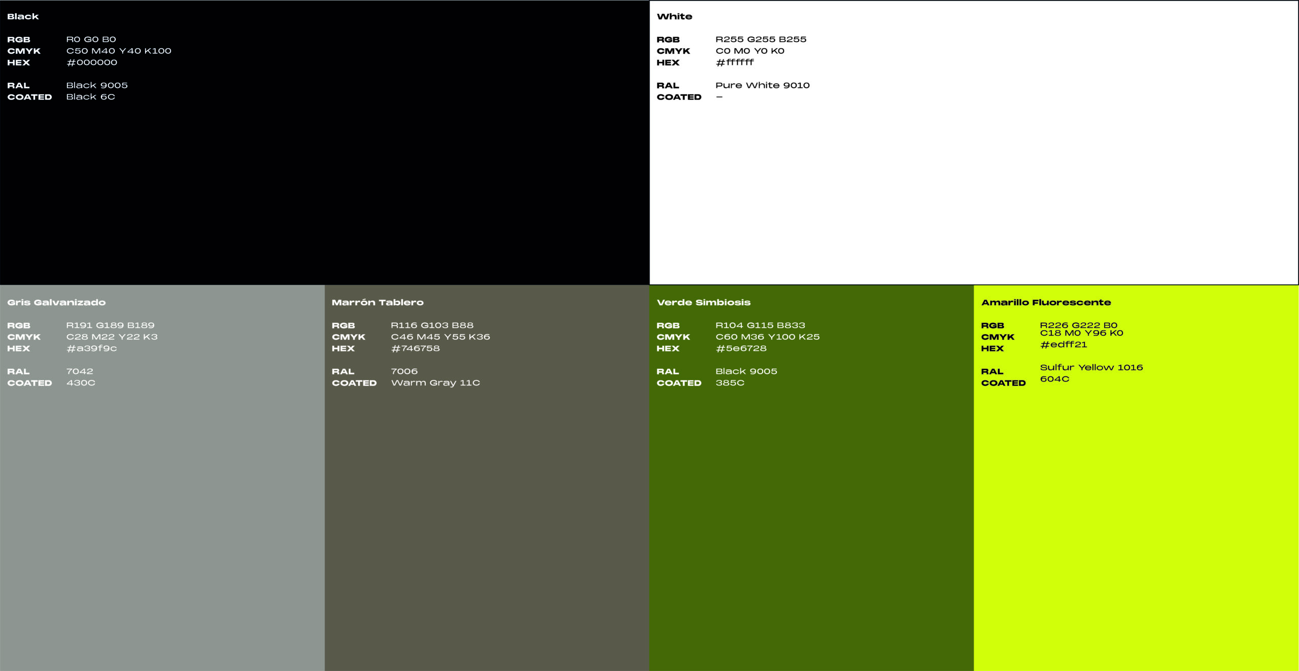
Chromatic range
When green is no longer green.
The colours have been rethought, based on Cidark’s current colour range, with the aim of making them more realistic and believable. In the landscapes around us, we rarely find forests with a deep and striking green. In fact, green is not usually the predominant colour in rural environments; there are other colours with greater strength and prominence associated with nature beyond this traditional reading of “green”.
The presence of Cidark technology in the colour palette.
Cidark’s quality, to a large extent, is the result of the choice and combination of its materials.
A visit to a Cidark construction project is enough to observe the great impact that both its “P3 System” and the rest of the construction materials they use have, tinting the environment with the tones of wooden boards, steel frames and cement. Including them in our colour range has enriched the brand’s discourse, providing the professional and technical approach inherent to its activity.
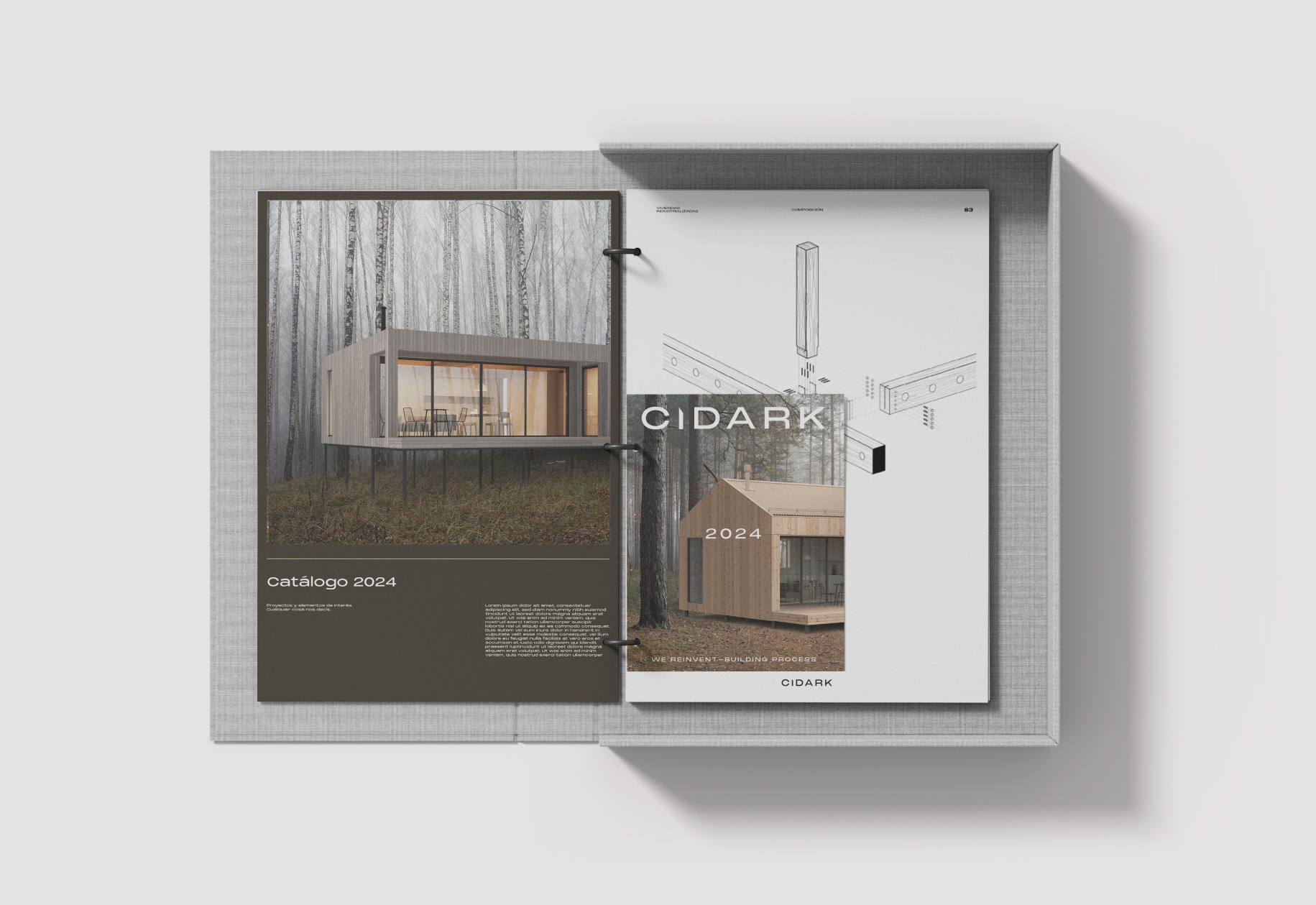
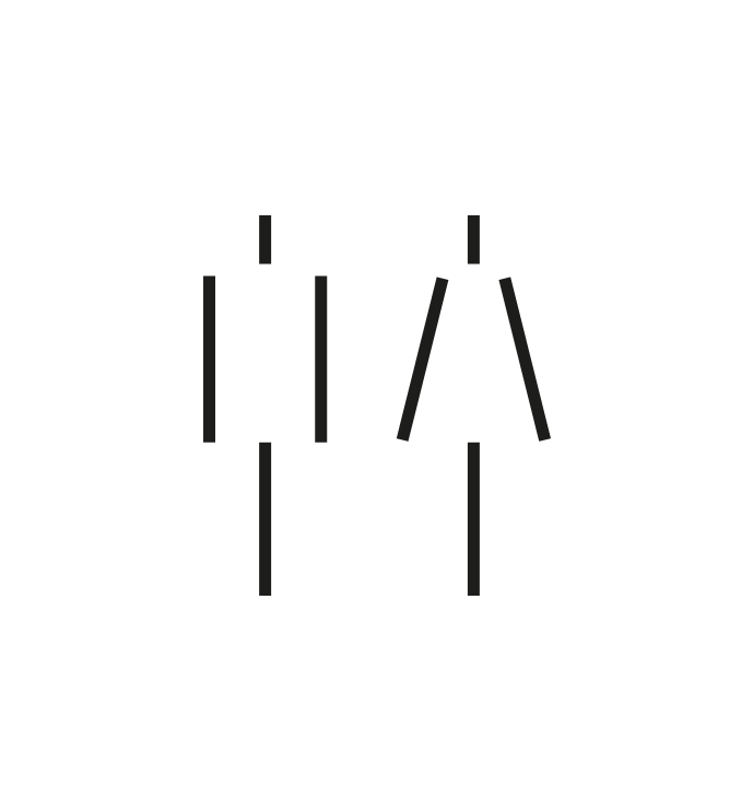
Graphic
Cidark’s expertise, excellence and detail expressed through its graphics.
The result of the three graphic configurations, together with the play of cuts and the evolution of size, serve to explain its flexibility and adaptability to different contexts or circumstances. With these applications we manage to attract attention and provide all the personality and meaning that the brand wants to convey to its audience.
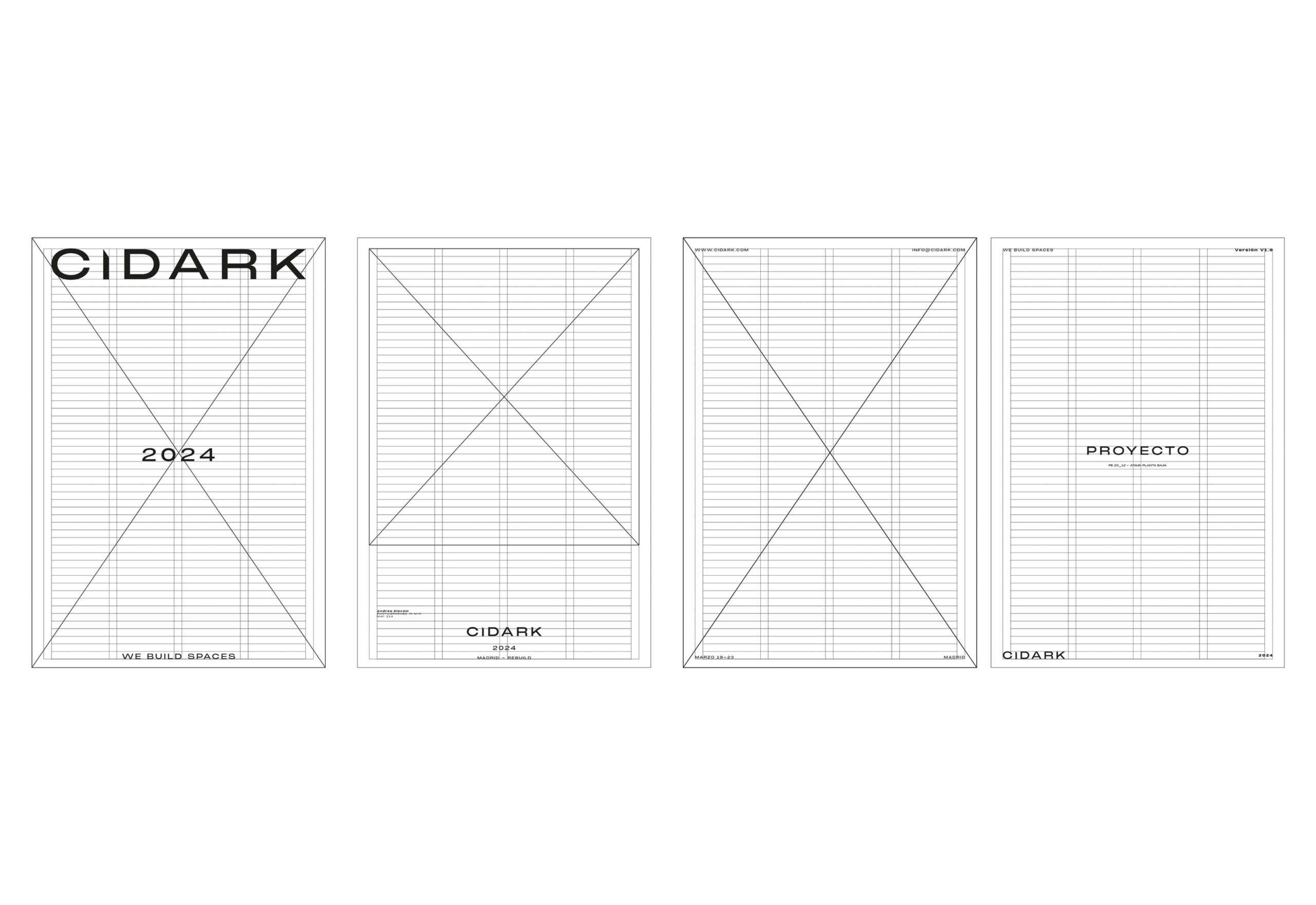
Layout
A system that acts as a central hub.
The visual content, collected in the different graphic supports, has the same function as the ‘P3 System’ in the buildings, it is the skeleton of the composition of the graphic pieces.
The layout is based on a common grid that allows precision and coherence in any graphic application.
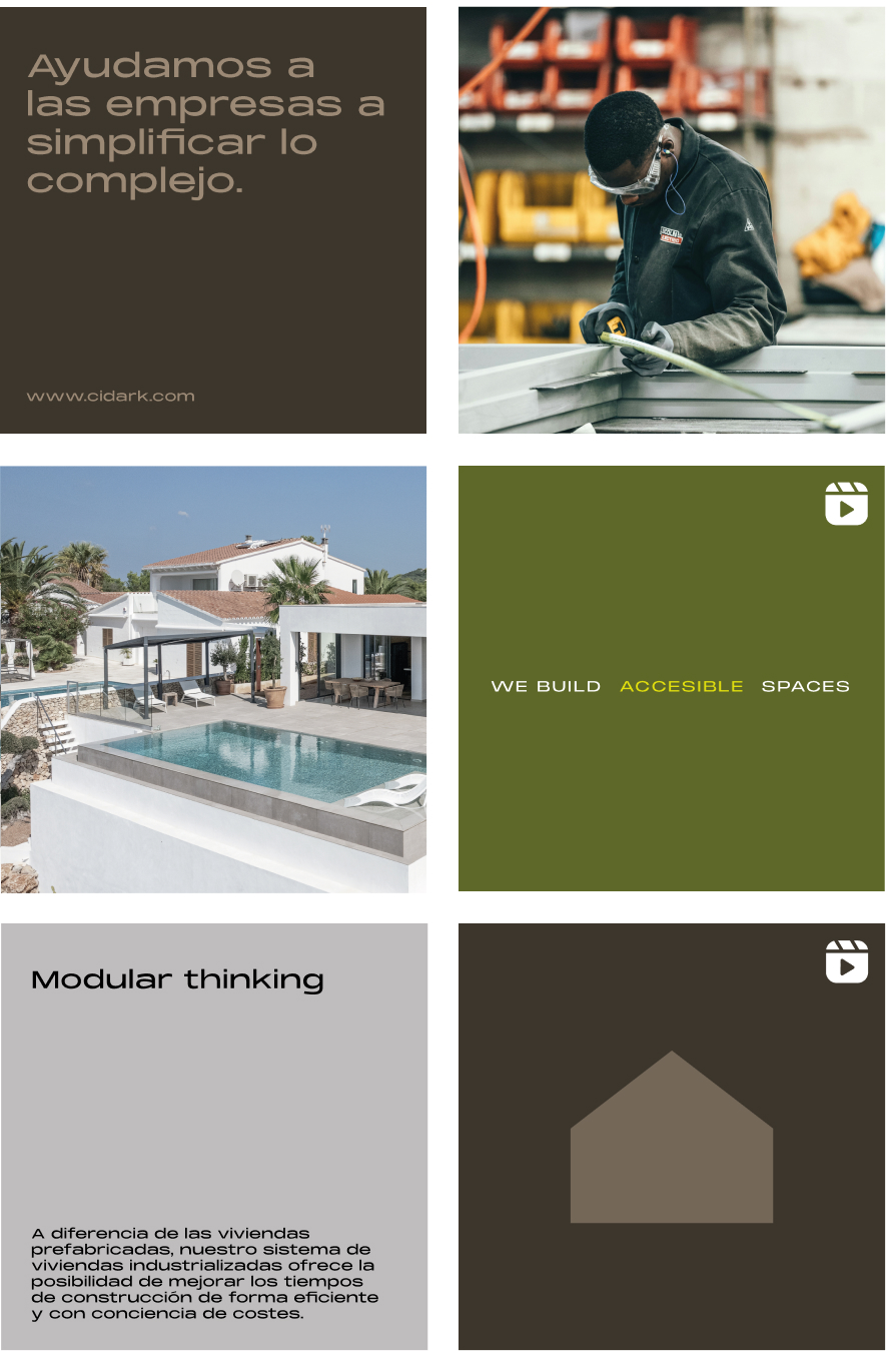
Social networks
To communicate the brand’s new direction, a new social media system has been designed. The goal is to create engagement and awareness in an industry as traditional as construction.
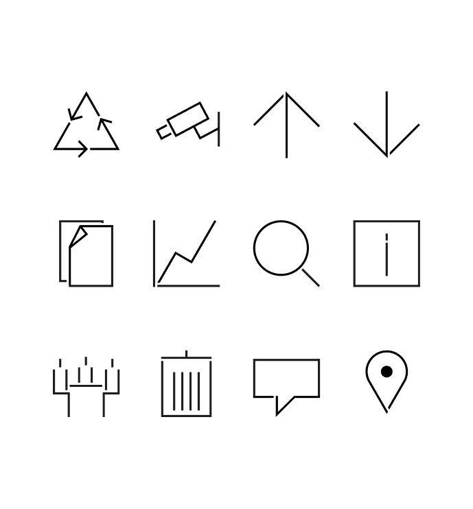
Iconography
To finish connecting all aspects of the brand, and having such a powerful concept as modularity, we could not miss a library of pictograms based on the geometric shapes provided by the ‘P3 System’.